A Logo for London
‘Few icons…sum up London as completely as the roundel,’ says Mike Brown, London Underground managing director.
‘Outside Underground stations, in its most famous form of blue and red, the roundel brings a sense of continuity and consistent to a rapidly changing city and world.’
A new book published next month, A Logo for London, sets out to show us exactly how iconic, enduring and significant the little red mark really is.
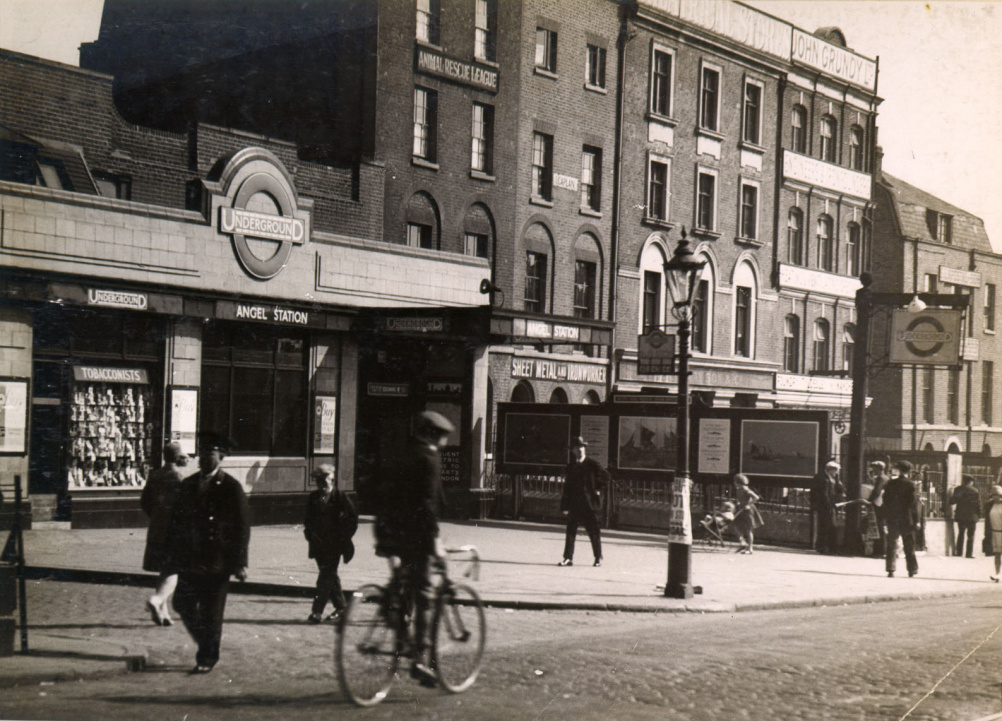
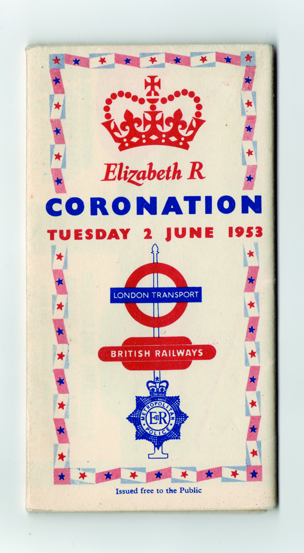
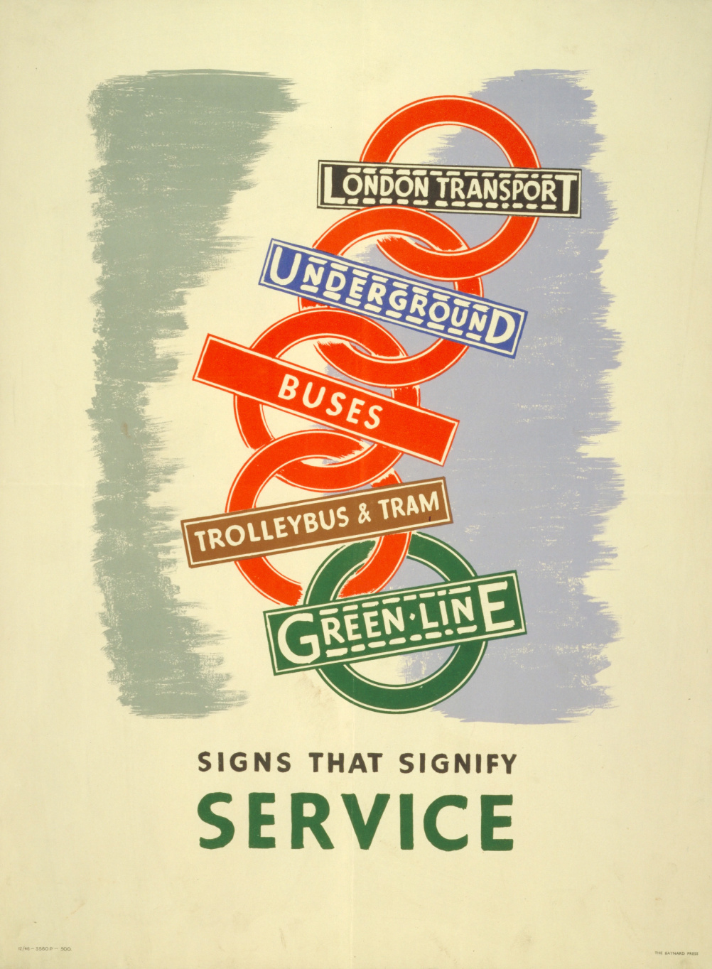
The book delineates the mark’s status around the streets of London since it first emerged in 1908.
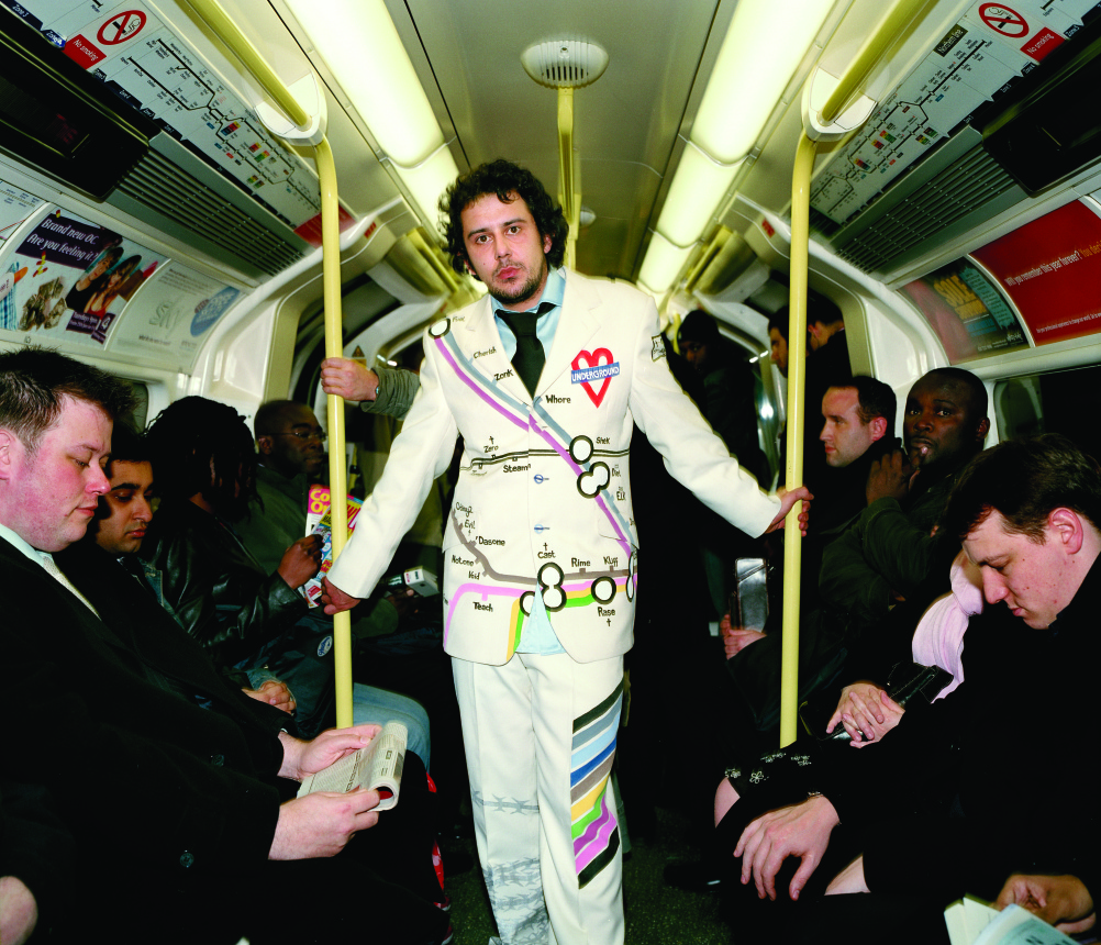
We see the various iterations of the symbol throughout the decades, from the functional, as a sign and a place marker, to the frivolous – recreated in souvenirs, as millinery and even in soup.
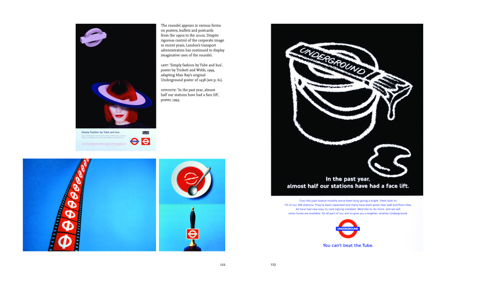
It’s a gorgeous history rich in beautiful imagery, showing the story not just of the symbol, but of London itself.
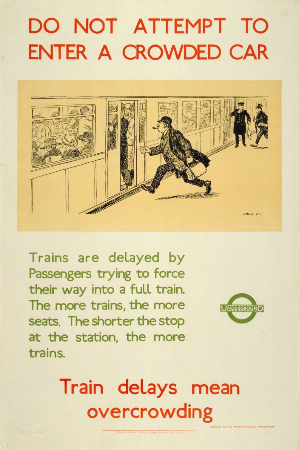
The roundel familiar to us in 2013 was in place by around 1919, courtesy of Frank Pick and Edward Johnston, who created the Underground’s Johnston typeface.
As A Logo for London proves, there aren’t many pieces of graphic designs that can elicit quite such a heartfelt, emotional response as the London roundel.
David Worthington, London Transport Museum trustee, says, ‘It’s a marker for the London I know and love, the moniker that sets London apart from any other capital city and the symbol of the time London and I will spend together whether for a weekend or a lifetime.’

A Logo for London by David Lawrence is published in October by Laurence King Press priced £19.95
Read this next


buy tramadol online tramadol liver damage – can buy tramadol usa