Blacksheep rebrands Middle Eastern coffee and spice company Bafarat
Blacksheep has created new branding for Middle Eastern coffee and spice company Bafarat, aiming to ‘evolve the business into a global brand.’
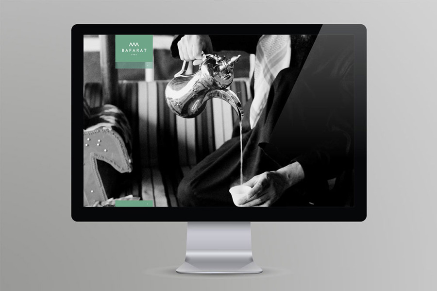
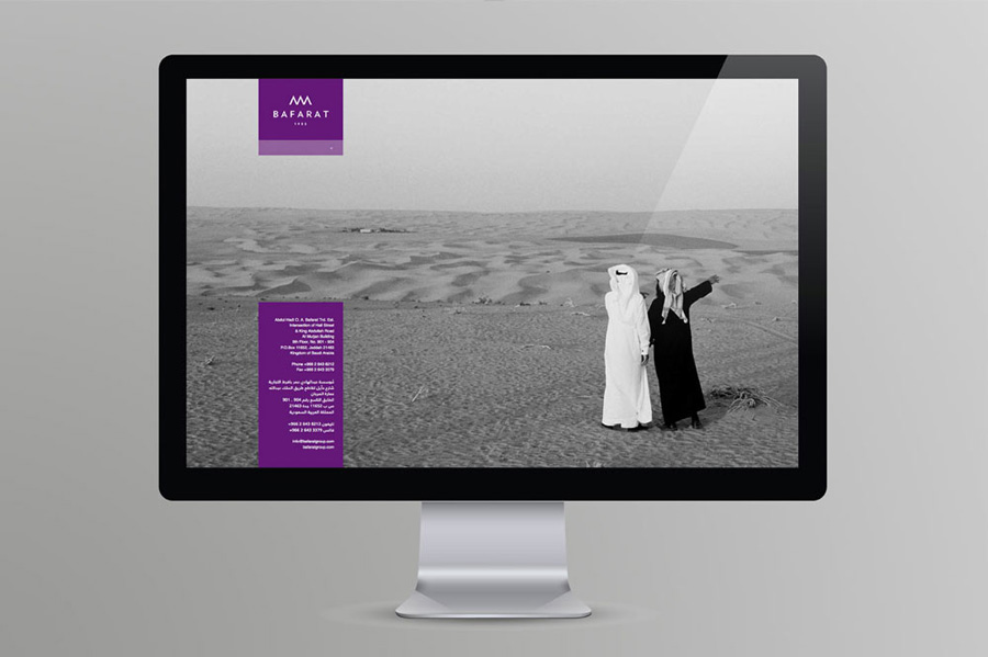
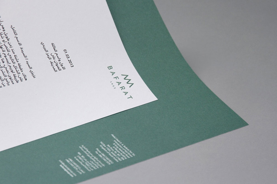
The designs are inspired by the brand’s Saudi Arabian heritage and culture, according to Blacksheep.
‘A driving force was the concept, “rich history, modern delivery”, creating a fine balance between modern and traditional’, says Blacksheep lead designer Annette Dennis.
Bafarat was originally founded in 1952, and remains a family business. There are currently 23 outlets in Saudi Arabia.
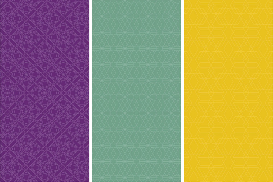
The new word-mark uses a geometric sans serif typeface, which inspired the three-peaked logo, as well as six geometric patterns that are used across the identity’s applications.
Blacksheep says, ‘The identity pays homage to the rich heritage of traditional Middle Eastern culture, yet offers a clearer, more modern aesthetic when used in conjunction with large areas of bold, flat colour.’
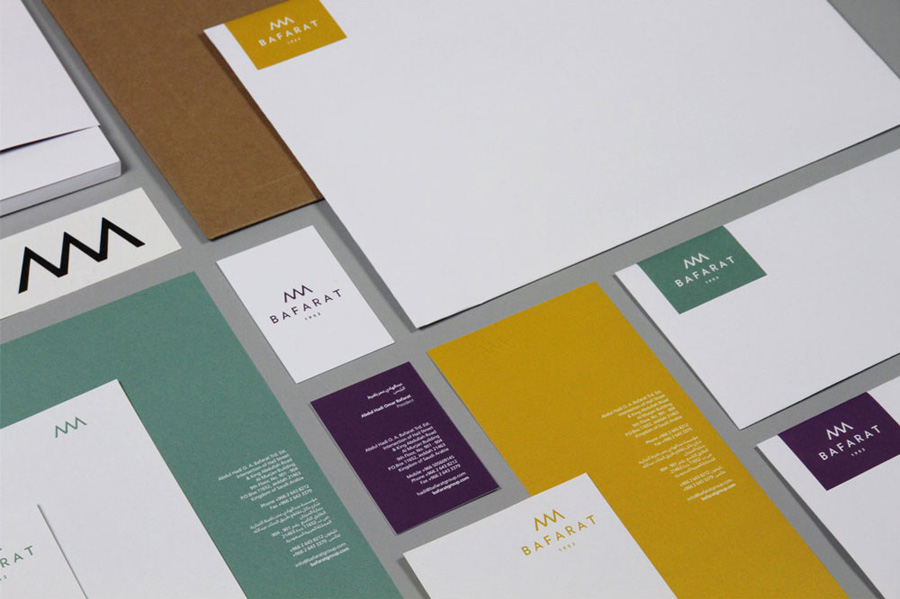
The new look will be used across all touch points including stationery, packaging, marketing collateral, the Bafarat website and signage and interiors for the existing stores in the Middle East.
A new Bafarat flagship store and coffee shop is due to open in Jeddah, Saudi Arabia, in the autumn.
Read this next

-
Post a comment


