Band-style branding for a rock ‘n’ roll-loving electrician
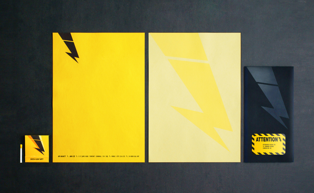
Afterhours has created a J-shaped electricity bolt identity for Cornish electrician Jay Bennett and brand expressions that also capture his love of rock ‘n’ roll.

Afterhours creative partner Moyra Casey says that the mark ‘captures his name and profession in one’ while the identity system ‘references his small, personal service, his love of rock ‘n’ roll and specialism in music and hospitality sectors.’
Low-budget solutions were sought for Bennett, who picks up a lot of his business through the live music scene, according to Casey.
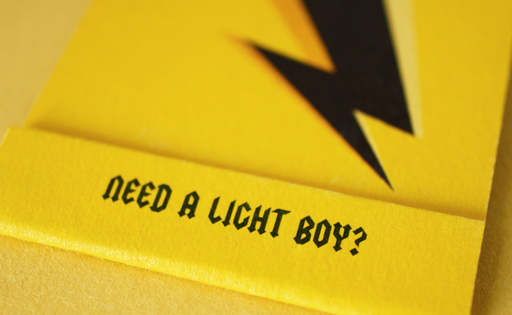
This includes making business cards of matchbooks which read ‘Need a light boy?’ and are ‘perfect to light a candle in a blackout’ says Casey.
The letterhead, which Bennett will use for invoicing, is digitally printed on sugar paper stock for ‘a raw, stripped back aesthetic’ she adds.
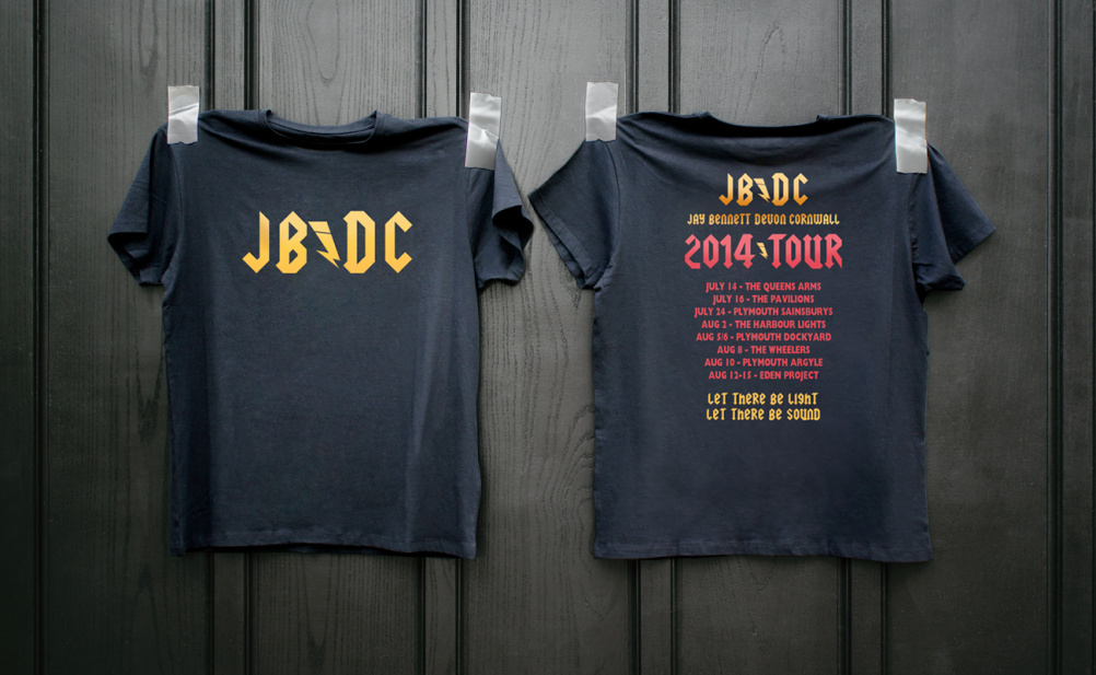
Band merchandise has been referenced, particularly in a T-shirt which, instead of listing venues a band has played, lists places Bennett has been contracted to work for.
The font used across everything is Squealer and it will soon be applied to a website and van livery, which are the next touchpoints to be designed.
Casey worked alongside creative partners Chris McDonald and Kelly Bennett, (sister of Jay Bennett.) All three previously worked at Springetts and officially opened Afterhours for business last week following a year of ‘behind the scenes’ work.

-
Post a comment


