New Chestertons estate agent identity references open door
Leahy Brand Design has rebranded London estate agency Chestertons, creating an identity that it says references an open door.
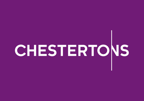
LBD managing director Tim Leahy says, ‘Our original motivation for the brandmark was to build on the idea of “opening” London.
‘Inspired by the trusty door and door handle, we created a brandmark that references this through playing with the relationship between the O and N.’
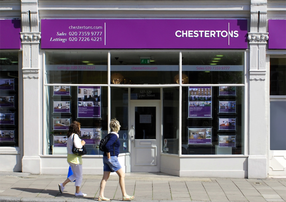
The rebrand follows Chestertons’ recent demerger from Chesterton Humbert to form a separate business.
LBD was appointed to develop the new branding. The consultancy says it conducted in-depth partner interviews and audit workshops, which resulted in the proposition ‘Open London’.
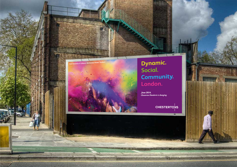
Leahy says the consultancy has used a ‘strong vibrant purple’ colour palette, with different colours used to represent different branches.
The new identity is currently rolling out across Chestertons’ London branches and international offices and LBD says it will continue to work with the company on new campaigns and projects.
Read this next


Is the ‘N’ the handle?
I’m struggling to get/see it which probably isn’t a good thing!
CHESTERTO’S?!
Really like this… nice to see a bit of wit.
Don’t you get it? The O is the handle with enough of the N behind the door with the S. There’s more than enough of the N to read CHESTERTONS.
Seriously this really struggles to work, I ‘see’ the door handle but it has to work far to hard and the fact that they have had to explain it so much!
I rest my case. Wit/concept in design has to work straight away and in this case it failed. Sorry
I’m struggling to see it I’m afraid. At no point until I read the explanation did I connect the ‘o’ to the ‘door’.
The fact that I had to read the explanation to get it probably speaks volumes.
Completely agree with two of the above comments. If it needs explaining then its failed as far as I’m concerned and I along with all the folk from our studio failed to make the connection.
The king is in the altogether, the altogether and so say all of us!
Nope don’t get it, the o is to similar to the other letters to read as a door handle, maybe it should have an asterix next to explaining that it is a door handle lol
The whole logo is far too linear to create any illusion that it is a door opening.
The connection is with the ‘N’ not the ‘O’ and the vertical line creates a division rather than union.
Given the reputations of Estate Agents is it feasible to create a logo which implies this?
Sorry, but this is such a shame. The version a few years ago with the EST (and date underneath) was picked out of the name was so much smarter in all ways. This is a huge step backwards. Fail.
I totally missed the door reference i think they tried too hard to fit something ‘clever’ in the logo, and forced something into it.