New-look Birds Eye products hit shelves
New Birds Eye packaging designed by JKR has hit the shelves as the next stage of the company’s £60 million relaunch gets underway.

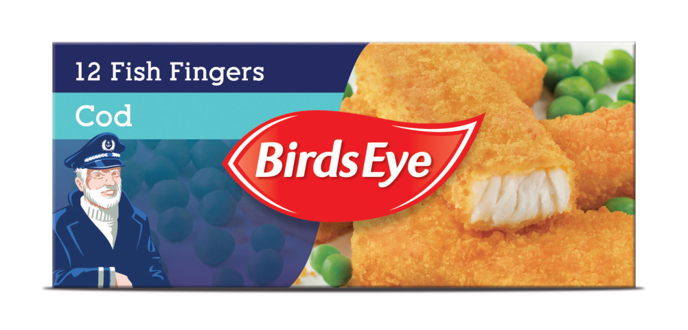
The new logo can be seen here on packaging for the first time and features a redrawn, simplified Captain Birdseye on certain products.
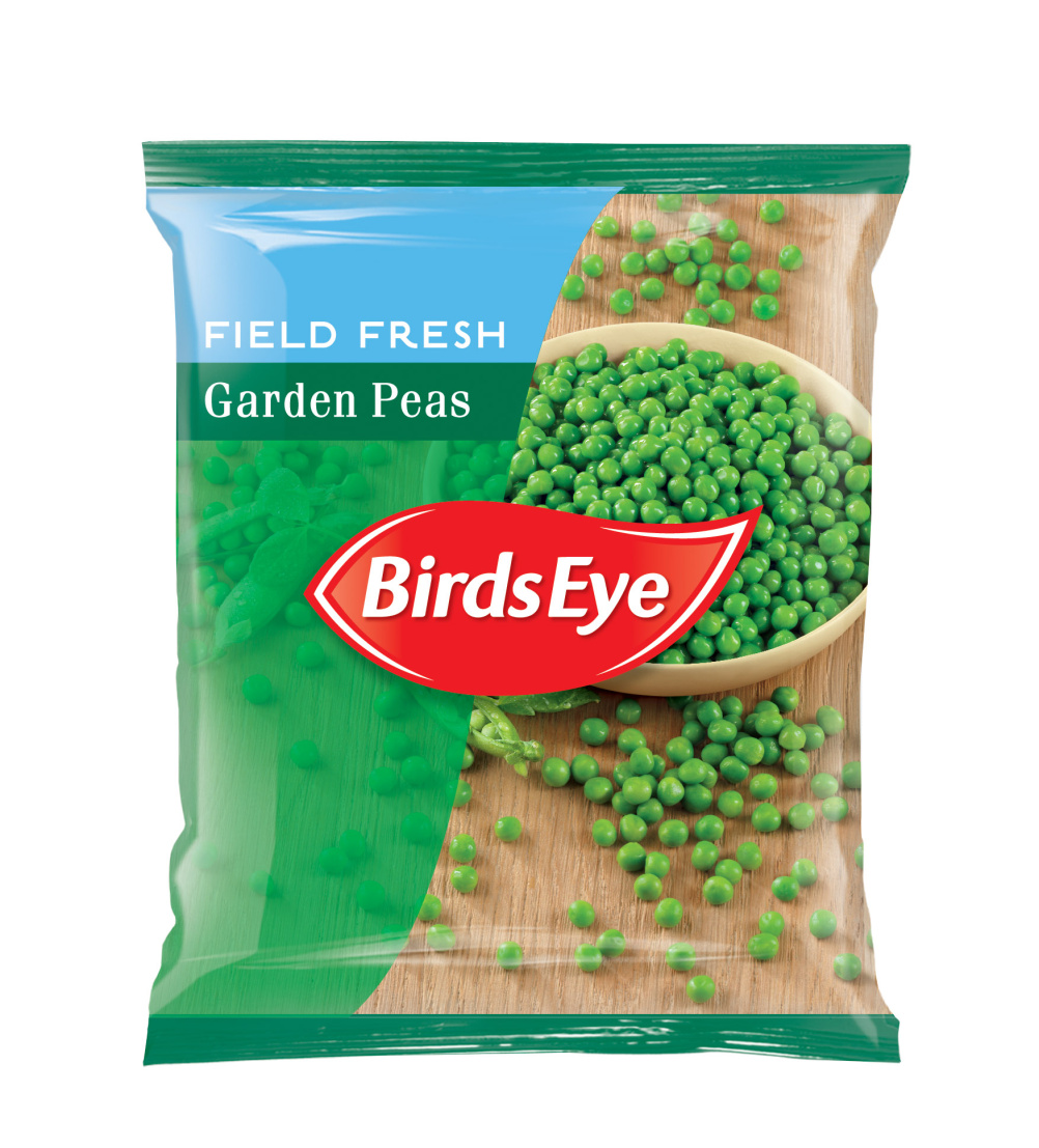
The Birds Eye logo appears at the centre of packaging to ensure shelf stand-out and new photography shows the food being ‘eaten and enjoyed’ in a kitchen setting.
The roll out follows ‘The Food of Life’ ad campaign by Havas Worldwide, which aired in March and saw Captain Birdseye replaced by a family eating the products.

JKR says its designs bring ‘warmth and personality’ to the brand’s portfolio and that the identity has a ‘clean and advanced-style look’ which will work well on screen – the touchpoint for digital marketing an e-commerce.
Brand owner Iglo Group wants Birds Eye products to be considered a ‘first choice’ rather than ‘fall back’ according to JKR.

Birds Eye General Marketing Manager Cheryl Calverley says, ‘Our new packaging completes the update to our master brand and reflects our popular “The Food of Life” campaign.
The refreshed packaging will help our products stand out on the shelves as well as delivering in increasingly important digital environments.’


Not impressed on any level. Reduces iconic brand to everyday look.
Looks like a good old “make my logo bigger” decision from the client. It looks terrible. There was nothing wrong with the packaging they already had.
Its a brave move, breaks conventions of logo must go top left. Certainly stands out on shelf… I just hope this wasn’t the driving force behind the design.
However – I’d like to see if this works across the whole range, and on more challenging pack formats and products where the Bird’s Eye logo starts to clash with the photography.
Sad to see old Cap’n Bird’s Eye reduced to a cheap bit of clip art now!
A sad departure from tradition 🙁
How sad to see a brand leader looking like a cheap own label offer.
For a master brand strategy there seems to be no consistent typeface here which is a bit odd.
The hero product image doesn’t exactly make the mouth water. It’s a shame that a frozen food brand looking to dispel perceptions of poor quality are now reinforcing them on pack.
Have to agree with the above comment. It really looks like a cheap own label offering.
I don’t buy the JKR waffle about ‘food being eaten and enjoyed in a kitchen setting’. To me – the photography looks cold, unappetising, and looks like it just food left on the side to go cold. Together with the cold colours – this design defeats the whole objective of making frozen food look warm, inviting and appetising.
Well done on the cheap, frozen look!
As an ex-marketer on that brand and as a consumer, I think this design looks really poor and not modern at all. Really disappointing.
Agree with all the above…looks like a cheap imitation and looks rushed… with even worse photography!
I wouldn’t normally comment, but really? I’m hoping that this looks a lot better on the shelves, or should I say in the freezer
The blue looks cold, the logo seems retro, and Captain Birdseye looks like he may have had a stroke and become Russian (no offence intended to Russian stroke victims)
I think the own brand comment elsewhere is a bit harsh. Some of the own brand stuff looks really attractive!