Rio organisers unveil ‘look’ of the 2016 Olympics
Marking two years to go until the Rio 2016 Olympics, the organisers have unveiled the ‘look’ of the games – showing how identity designs will work across venues, products and uniforms.
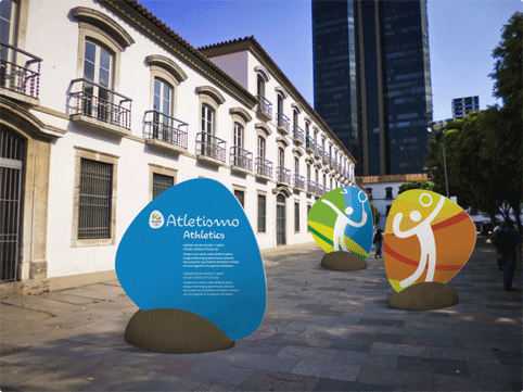
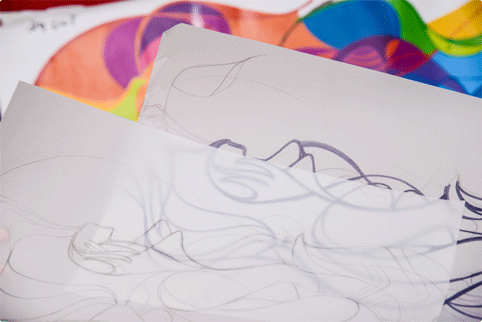
Rio 2016 says the branding was developed by its in-house design team over a 12-month period. It is based both on the ‘motion and performance’ of Dalton Maag’s Rio 2016 Olympic typeface and on the ‘contours’ of the Rio 2016 Olympic and Paralympic logos, which were created by Brazilian consultancy Tátil.
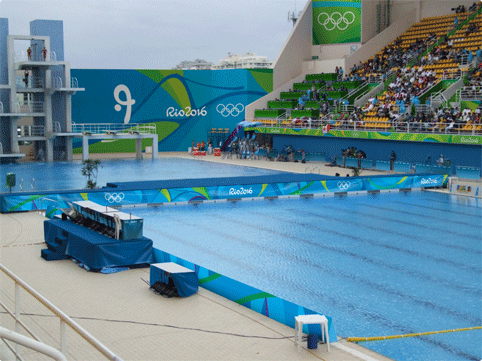
The team worked to develop brand applications for sporting venues and across Rio de Janeiro, as well as on tickets, uniforms and licensed products.
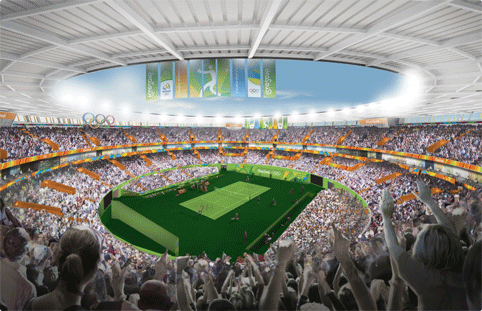
The organisers say the visual identity is ‘inspired by the rich landscapes of Rio and Brazil – full of the sinuous curves of mountains, rivers and lakes. The city’s best-loved icons, including Sugarloaf Mountain and Corcovado, will all take part in the celebration.’

They add, ‘The design team produced a visual identity for the Games using images of Rio easily recognised throughout the world.’
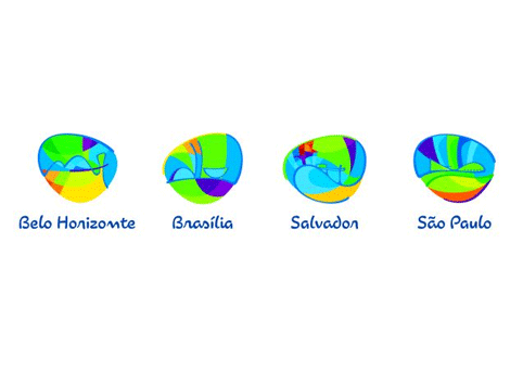
Beth Lula, Rio 2016’s brand manager, says, ‘The starting point for the new “look” was the Rio 2016 branding, with its essential ingredients of passion and transformation, and its values and attributes.’
You can read our interview with Tátil creative director Fred Gelli, in which he discusses the development of the Rio 2016 identity, here.
-
Post a comment


