What is your favourite example of hidden symbolism in a logo?
Designers tell us of some classic identities and personal favourites that play tricks on the eye or are imbued with symbolism.

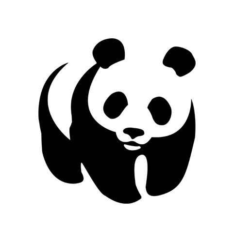
‘The design classic is FedEx by Landor, but I’m sure that falls into the “I didn’t see it” category for the general public. The same goes for the elusive bear of Toblerone, or the A-Z in Amazon. Personally I think jokes are better when the punchlines are understood, so I’d opt for the Girl Scouts logo by Saul Bass, The Guild of Food Writers by 300 Million, or the WWF logo (the panda one). Beautifully simple.’
Oliver Maltby, creative director, Interbrand Australia

‘There are so many good ones to choose from but a personal favourite is the logo for Heart & Sold by designer Matt Maurer [formerly of Music]. Heart & Sold is a UK initiative that seeks to inspire and teach artists with Down’s Syndrome and promote the idea that this art is from “the heart” and not a product of the condition. The logo is a simple everyday brass picture hook with a cut out heart in the middle, (something I had never noticed before!) The empty hook represents another picture sold, while the heart inside is a symbol of the artist’s passion and the love of those who invest in each piece. I really like the fact that the mark is just a found object with this emotional symbol within waiting to be discovered. It says “heart and sold” in a single clever visual expression. I love the simplicity, its cause and sentiment and the way that the little “hidden” emblem becomes so memorable in my mind (and heart).’
Kelly Bennett, creative partner, Afterhours

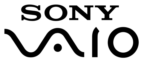
‘My favourite example is the classic use of negative space in Richard Runyon’s FedEx logo. I like it because it’s bold and so symbolic, yet not overtly noticeable. At the other end of the spectrum, with a hidden meaning that works well is Sony’s “Vaio” word mark. It includes an analog “wave” and the digital combination of “0” and “1”, while delivering a well-balanced and ownable identity.’
Simon Forster, creative director, Robot Food

‘The Toblerone bear is a geeky favourite of mine – a real hidden gem that few people apart from us designer-types notice. However when you see it, it’s unmissable. Gently pawing at the Matterhorn, the design doesn’t force it, rendering it a lovely discovery, apparently representing the honey in the product. Sweet.’
Bronwen Edwards, creative director, Brandhouse

‘My favourite example of hidden symbolism has to be the bear within the Toblerone logo. Building on the brand story (the bear is the symbol of Berne where Toblerone is produced), it imbues even more charisma into an already distinctive brand. Like many other examples of this nature, it delivers that extra magic by rewarding a closer look.’
Daniela Nunzi-Mihranian, creative director, JKR

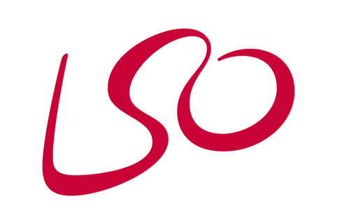
‘I won’t choose our own logo for Hot Bikram Yoga, which shoe-horned three – yes three! – different symbols into one mark, nor will I choose the designer’s favourites My Cuisine Canary Wharf or the Guild of Food Writers, nor the classic FedEx, nor the Toblerone bear that someone reminded me of the other day. I’m going to go for the LSO logo, which for years eluded me as it’s so simple that I just wasn’t even looking for it.’
Algy Batten, partner, Fivefootsix
Read this next


Great piece. Personally, I love the LSO mark. Subtle but expressive.