Type tips
‘(S)pace Yourself. Know Your Audience. The Client is Always Right.’ These little maxims could really apply to many different situations in life – from work, to spouting nonsense on your local, to well, drinking in your local (see first point).
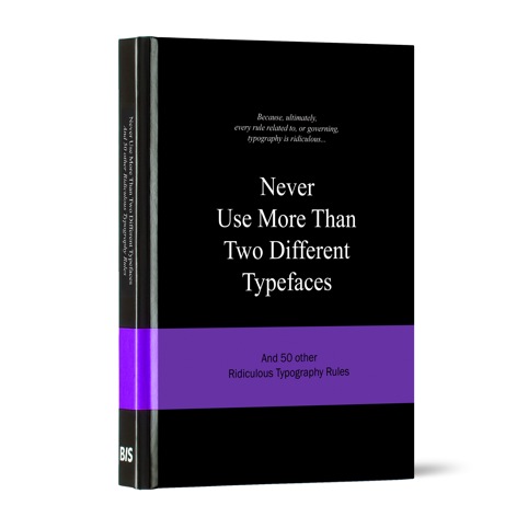
However, where they really come into their own is amongst roughly 47 other nuggets of advice in beautiful new book Never Use More Than Two different Typefaces and 50 Other Ridiculous Typography Rules by Anneloes van Gaalen.

Published by Amsterdam-based publishing house BIS Publishers, this is the fifth book in the Ridiculous Design Rules series.
The book forms a handy designer’s go-to for the rules of typography and other more general pearls of wisdom.

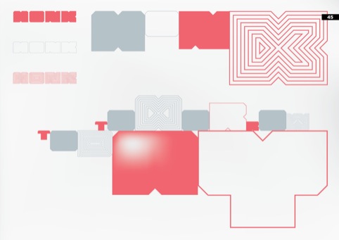
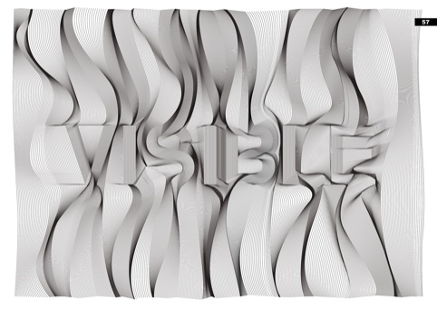
And it certainly seems as though the book practices what it preaches: each page is beautifully set out and thoughtfully illustrated, set off with quotes from graphic designers and typefolk from the around the globe over the last hundred years.
The illustrations are beautiful, including bold monochrome hands, and for the ‘Never use a space bar to align text’ rule, we’re presented with an eager pink hand muddling through scattering keyboard letters with a space bar stick.

The tips are frequently thought provoking: ‘Don’t try to be original, just try to be good’ warns rule number 36. Or, as Ivan Chermanyeff, 1932 American Graphic Designer, states, ‘Sometimes there is simply no need to be either clever or original’. Phew.

Never use more than Two different Typefaces and 50 other Ridiculous Typography Rules is out now for BIS publishers, priced at £15.
-
Post a comment


