Google+ launches ‘simpler and more beautiful’ redesign
Google has redesigned its social networking service Google+ to make it ‘simpler and more beautiful’.
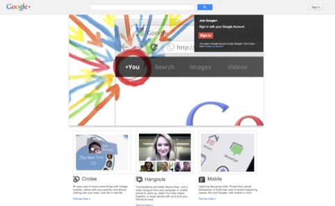
This is the first major redesign of Google+ since it launched in June 2011.
Google says it has aimed to make the service more ‘functional and flexible’. It has introduced a dynamic ribbon of applications on the left-hand side, which replace static icons at the top.
It has also introduced flexibility into this app structure, allowing the user to drag them up and down to set the order they want, as well as accommodate any future app developments.
The redesign also allows users to post full-bleed images or videos and introduces a stream of conversation ‘cards’ to make it easier to join discussions.
Other new features include a new Hangouts page, which uses live video, and a new Explore page to show what’s trending across the network.
Google senior vice-president Vic Gundotra says, ‘[It’s] easier to use and nicer to look at, but most importantly it accelerates out efforts to create a simple, more beautiful Google.’
Read this next


Massive typo in the headline, there! Who proofreads these things?