JKR rebrands Billington’s sugar
JKR has designed a new visual identity and packaging for Billington’s sugar, inspired by the brand’s Mauritian origins.
The consultancy was appointed to the project about a year ago without a pitch due to a previous relationship with the client, according to JKR design director on the project, Martin Francis.
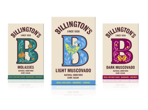
The new packs are centred on the ‘B’ of the brand name, with different colour palettes and imagery within the letter for each of the ten products in the range.
Francis says that the brief focused on bringing ‘more personality’ to the brand, inspired by the colourful tropical nature of Mauritius.
He says, ‘The existing packaging was very brown and quite colourless. We wanted to bring in a bit of the personality of the island to make it more colourful.’
‘There was very little on-shelf recognition – people were buying it for the product.’
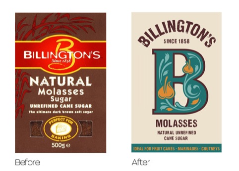
JKR designer Adam Swan adds, ‘We chose to focus on the juxtaposition which exists between the refined nature of Billington’s founder Edward Billington and the unrefined nature of the sugar itself. To this end, we used Billington’s word mark and bold decorative ‘B’ to play to these two personalities.’
Read this next


For the name of brand symmetry surely the fonts for the Billington name and the ‘B’ should be the same?
Sweet!
Where’s the bow tie?