London 2012 design icons – the Olympic stadium
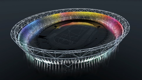
The centrepiece of the London 2012 Olympic Games, the Olympic Stadium in Stratford will be able to accommodate up to 80 000 people throughout the Games.
Source: Populous
Olympic Stadium
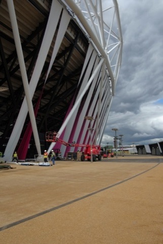
A functional, rather than necessarily a beautiful design, the stadium has been designed with legacy and flexibility in mind – when the Games finish it will be converted into a 60 000-seat sporting arena.
And as with all stadia, there are plenty of impressive sounding statistics. Stadium designer Populous – a specialist in sports architecture – says the venue features 50km of seats lined up side by side, and glass balustrades in 56 different colours.
The main seating bowl is described by Populous as ‘compact… bringing all 80 000 spectators far closer to the event that previous Games venues.’
Source: Populous
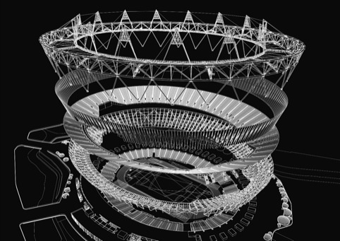
Olympic Stadium exploded diagram
Above this bowl is the main stadium structure – featuring the temporary upper seating tier – which is made from tubular steel. Seats are in black and white, to allow the Olympics branding to stand out.
External colour is provided by an exterior wrap, which will circle the entire stadium. Initial talk suggested that this would either be made from a sustainable material, or take in interactive elements. Last year Dow Chemical announced it would sponsor the wrap.
The wrap has been designed by artist Sophie Smallhorn and installed in a project with a total cost of £7 million. It is formed from canvas banners that run from the top to the bottom of the stadium’s exterior, creating 300 ‘doorways’.
The wrap uses the four main brand colours of the Olympics logo – green pink and orange – with each colour designating one of the four stadium entrances.
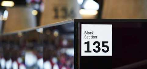
Populous Activate, a division of the architectural firm, has worked on the wayfinding for the stadium, as well as other Olympic venues.
The consultancy says, ‘We knew we had to create a set of graphic principles that would be flexible enough to be applied to different kinds of venue while ensuring clear, inclusive and elegant signage.
Source: Populous
Olympic Stadium wayfinding
‘For it to work, it also had to be visibly different from the highly colourful look of the rest of the 2012 communication.’
The result is a system of black-and-white communications, predominantly based around numerals and pictograms. Where text is used, the FS Dillon typeface has been brought in.
In the stadium, Populous Activate says it has aimed to bring colour to the signage system, without compromising its black-and-white aesthetic.
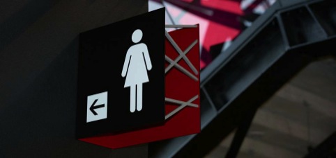
Source: Populous
Olympic Stadium wayfinding
Signs have a C-shaped cross-section, referencing structural beams. The face of the signage features black and white information, while the inside of the sign is coloured to match surrounding glazing. The sign edge is cut in a ‘shard’ shape, a nod to the 2012 branding.
Elsewhere, 4.2m-high concrete and steel totems are used, and large block numbers are placed directly on to concrete columns.
Much of the media attention around the stadium has focused on what will happen to it after the Games. After initial attention from groups including Middlesex County Cricket Club, London Wasps rugby team and even the NFL, two bids were shortlists in 2010 to take on the stadium, from football teams Tottenham Hotspur and West Ham.
Source: Populous
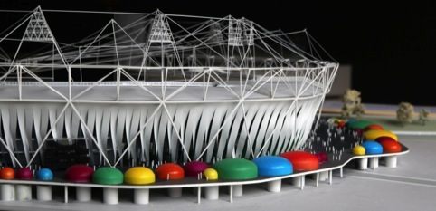
London Olympic Stadium Model
The West Ham bid was selected, but subsequently collapsed, and the stadium’s future is still up in the air, with potential tenants now including West Ham (again), fellow football team Leyton Orient, Formula 1, and the University College of Football Business.
One thing that is certain is that the Olympics won’t be the last sporting event to be hosted at the stadium – the 2017 World Athletics Championships will be coming to London and will be hosted at the stadium.
Read this next


I particularly like this bit: ‘For it to work, it also had to be visibly different from the highly colourful look of the rest of the 2012 communication.’
You mean “We ignored the terrible corporate ID and abysmal typeface and made something nice instead.”
shut it you silly nerd
this sucks but it could be awesome if you added the mascots of the oylimpic 2012 london and how many games are going to be played in the 2012
london oylimpics
I’m surprised there’s no mention of the lighting effects and electronic replay boards. That’s an entire subject unto itself.