Pearlfisher creates identity for Harrison’s Fund charity
Pearlfisher has designed the identity for new charity Harrison’s Fund, which was founded to raise money to fight Duchenne Muscular Dystrophy.
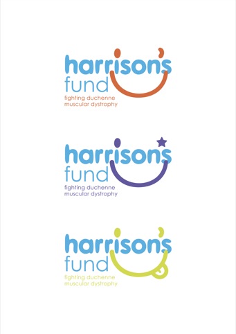
The charity is named after a five-year-old boy, Harrison Smith, who suffers from the disease, and it aims to direct money into research for a cure.
Pearlfisher was appointed to the project in September last year, having worked with the charity’s chief executive Alex Smith on projects for the Moma Foods, of which he is commercial director.
The identity is inspired by Harrison Smith’s ‘playful spirit’, with the smiley face icon formed from the dot of the ‘i’ and the apostrophe in his name; and the bright blue and orange colour palette reflecting his character. The identity is shown across all collateral including stationary, T-shirts, postcards and the website.
Pearlfisher created the strapline ‘make time’ to highlight the rapid rate of deterioration the disease causes; while also encouraging people to ‘make time’ to raise money for the charity.
Natalie Chung, Pearlfisher creative director says, ‘We wanted to create a fun and
informal identity that was inspired by Harrison’s playful personality and reflected the core vision of making the most of every second. Similarly, an identity that was impactful and that inspired people to help the fund succeed.’
Alex Smith, founder of Harrison’s Fund adds, ‘As a charity we want to be a breath of fresh air, whilst this is a very serious cause, currently with a bleak outlook, we are always, and always will be, up-beat, vibrant, fun, bold and enthusiastic….just like Donna, myself, Harrison and our youngest William.’
Read this next

-
Post a comment


