Tesco launches redesigned value range
Tesco has replaced its Value range with the new Everyday Value brand, which ditches the previous blue-and-white-stripes in favour of new, colourful designs.
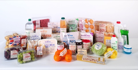
Tesco says the new range, designed by consultancy Rocket, is ‘more colourful and softer than the blue-and-white of the old Value range’.
The new designs feature a range of colours on different products, as well as a new series of graphic devices on packaging.
The retailer adds, ‘We have also improved the way it functions, including biscuits in easy-open packets, grated cheese in resealable bags and fruit juice in easy-pour cartons.’
Rocket was appointed to the work in December 2011 from the Tesco roster, according to creative director Marc Seviour. The consultancy also created the original designs for the Value range in the 1990s.
Seviour says, ‘The original blue-and-white stripes took their influence from the Tesco carrier bags, but recently there had been a lot of customer feedback that it looked cold and unemotional. It’s a basic range but there’s no need for it to look basic.’
Rocket has added a cream background, a palette of colours and a series of icons which can be used to create individuality on different products. Seviour says, ‘We’ve aimed to make it warm again.’
Dave Wood, Tesco UK marketing director, says, ‘Tesco was the first supermarket to launch a Value range back in 1993, the blue-and-white-striped brand giving customers a down-to-earth option.
‘Almost 20 years on and an affordable quality range is more relevant than ever, but customer needs have changed.’
Tesco says it has reviewed more than 550 lines to create the new Everyday Value range.


Not a fan tbh, looks like a cross between the recent Wieden+Kennedy Lurpak campaign and the IKEA campaign which was delivered by a collective of students.
Either way it’s un-original and uninspiring in my opinion.
It is the value range, so the designers cannot make it look TOO good, otherwise sales of ‘premium’ brands may be effected…
Ah, how the old blue and white stripe reminds me of my student days!
Yawn.
Just like sainsbury’s budget range (red/orange text)
“Ker-ching” for Rocket design.