The Associated Press unveils new look
News giant The Associated Press has rebranded with a new identity system designed by New York-based consultancy Objective Subject.

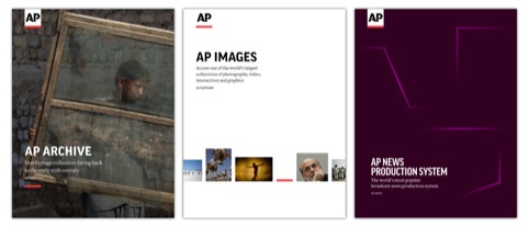
The system unites all AP businesses, products and services under a new master brand, presented as a stencil style logo in black, underscored by a red line. However a flexible colour system also denotes different products and services.
AP says the rebrand is the first significant change to its look in 30 years and that the move follows the development and implementation of a master-brand strategy in 2010.

AP President and CEO Tom Curley says ‘This new look, from logo to colour system, translates to AP’s growing portfolio of digital products and platforms, and distinctively relays our role as the definitive source for news.’
The new system will be rolled out in stages over the next year, starting with a new AP.org site in March followed by new video, archive and image sites according to AP.
Read this next


Did they lift my twitter logo@ashleygoodall ?
which, of course took less than a day to design.
So what exactly about the logo say the AP has a growing portfolio of products and platforms?
I prefer the old to the new. Neither say anything about what they do, but at least the old one was identifiable.
I like. Clean, crisp and strong. The use of colour underline gives it an edge and a bolder impact. Very corporate, conventional and will work well across all processes. A good example of ‘moving on’ a brand rather than inventing something new.
Hi, I’m a graphic designer. It’s a very interesting news. Why the red? Is there any explanation?