The Big Issue relaunch is ‘most dramatic overhaul in its history’
The Big Issue is relaunching today with a new look developed by editorial designer Ingrid Shields and the in-house designers at Dennis Publishing.
In what magazine’s UK editor Paul McNamee is calling ‘the most dramatic overhaul of the The Big Issue’s image in its 20-year history’, the publication is to look more confrontational and graphic, reflecting a shift to deeper and more political content.
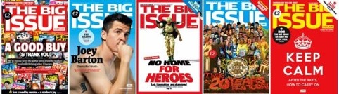
The new look has a simple layout with a red, white and black colour palette and uses more illustration, rather than stock photography.
The focus of the redesign is on the cover. McNamee says that without a place on supermarket shelves and with more free magazines given out on city streets, it is becoming increasingly challenging for the publication, sold by street vendors nationwide, to stick out in the crowd.
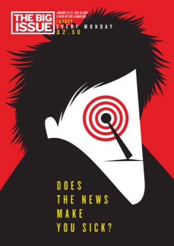
The cover of Issue 000 of the new look The Big Issue is an illustration by Noma Bar. It is free from all coverlines other than the title of the main feature ‘Does the news make you sick?’
McNamee says: ‘Consumers are not going to stand and flick through the magazine and we aren’t seen in supermarket lighting so the bright red and stalk yellow of our first cover is good for this time of year.
‘Our first issue is absolutely stunning; a dramatic change. I’m nervous about what people will think, anybody is when you do something as radical as this, you want people to like it, but I’m not nervous about whether it works or not.’
Dennis Publishing has been providing design, subbing and production services for The Big Issue since they formed a partnership with the weekly magazine in June.
Freelance designer, Ingrid Shields was brought in by Dennis in December to help with the redesign. She says she saw The Big Issue’s distribution method as license to do things differently, designing the covers to be more like iconic posters than ‘poor man’s newstand covers’.
She says, ‘We wanted it to look great on a coffee table, not too edgy, the magazine has a very wide demographic, but clever with good graphic statements. We have the freedom to have the logo as more of a brand as less of a masthead. It has been an exciting project.’


Whats’ with the price hike?
Is the cover graphic enough to stand out against other titles? No, not really
Quite why Dennis Publishing called in outsiders, instead of encouraging inhouse talent, baffles me
I feel that the magazine has lost it’s identity somewhat. 15 years ago it was trendy, current and something you’d want to purchase with a cover that would reflect that. Personally I think this could be a move in a very wrong direction… People are attracted to the magazines because of the cover content… I’d be interesting to see if the sales increase (with the price hike)… I doubt it!
It’s not just the mag that is a failing relevance – the Big Issue charity is losing it’s way. Where I live, the regular seller of the TBI has been doing so for years – she has had two babies and yet she is still there selling the mag. Please explain to me how the charity has helped her and her family move on?
It is true, The Big Issue needs a renaissance in it’s commitment to giving a voice and sustenance to the socially deprived, not ploughing through a comesmetic rebranding that only interests the visualartti.