Voxpop – What do you think the colour of 2012 will be?
Pantone has announced that Tangerine Tango is the colour of 2012. What colour would you choose to represent the coming year and why?
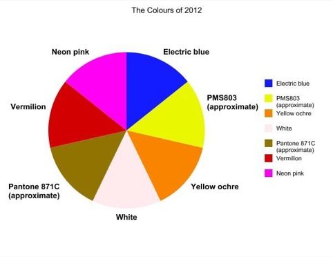

‘Electric blue, as we’ll need to look through the grey stormy (again) horizon to a more optimistic and bright year ahead.’
Franco Bonadio, chief executive, Identica

‘I think with all the doom and gloom of 2011 we’re probably all feeling a little bit PMS5195. A good dollop of PMS803 might be just what we need to cheer us up. But what I think we really need in the coming months is a fresh start. For me 2012 is a bright white kind of year – like a fresh sheet of paper full of potential, waiting to be filled.’
Ross Shaw, design director, Roundel
‘Yellow ochre. Sometimes we try to push forwards so fast, we forget the best of what’s already been. For my colour of 2012, I’m looking back to something as warming as the sun, as beautiful as dawn, as full of energy as Africa, as cultured as Egypt. Ochre is the earth. It’s strong and it’s dependable. And it’s my winning colour for our Olympic year.’
Rob Self-Pierson, freelance writer and 26 board-member
‘In this new era of austerity I think either black or white would be highly appropriate. However, if I had to choose one colour for 2012 I’d have to go for white – it’s the ultimate in purity, simple and uplifting, while black indicates the complete absence of light and, presumably, absence of colour as well. On that basis, therefore, white indicates the presence of every colour, so in theory we can have all of them in 2012!’
Martin Nixon, managing director, Nixon Design

‘Pantone 871C. After bandying around the obvious choices of gloomy black and bank-balance red, we settled for the lasting allure of the purest gold. If you can afford to buy some it’s probably a wise place to spend your money in the coming year and if you’re in need of a few extra pennies you can guarantee that there’ll be plenty more ‘Cash for Gold’ schemes popping up on your daytime TV screen to keep your bank balance topped up nicely.’
Ruth Watson, copywriter, Raw

‘I would be less annoyed by these arbitrary campaigns if they were more honest about it, something like, “We chose a stormy grey because it’s going to be a tumultuous year ahead.” But, since they are going for tangerine, I’ll go for a vermilion (pantone 172), because I’m starting to like similar colours together that almost match but actually clash.’
Iain Foxall, director, Foxall

‘I believe that the colour of 2012 should be Pantone 806 C – neon pink. In this confused, uncertain world of famine, war, global warming and financial craziness we need a colour that will jump out and cut through the grey skies – a colour of passion, celebration and neon intensity – to combat the apocalyptic darkness and make the future bright and I can think of no better colour than neon pink to be that colour – the colour of humanity, progress, positivity and change.’
Ab Rogers, founder, Ab Rogers Design
Read this next


Rather grotesque as a combined palette!
Personally, I think the Pantone 806 C will be a choice for Interiors and Yellow Ochre and Electric Blue for fashion. Why Pantone 806 C?
It is calm colour, which bring us closer to the Earth. I belive that 2012 will be a year of well balanced Interiors infused be bright colours like Green Lime.