Design by St creates Brutalist-inspired Cemento identity
Design by St has created a Brutalist-inspired identity for Cemento, a concrete product distributor.
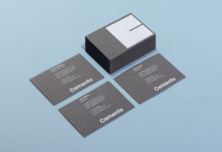
Cemento is a new UK start-up that distributes a specific Italian concrete veneer for wall panelling and furniture.
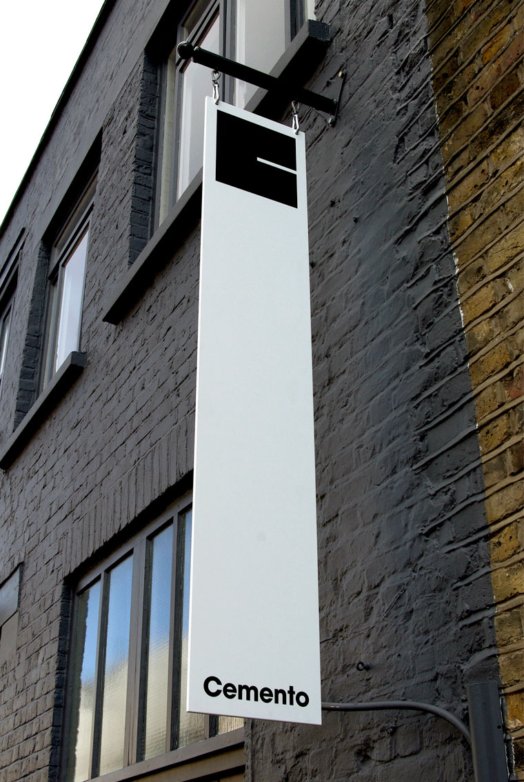
The identity, says Design by St, represents this with a ‘stylish, Brutalist and robust’ look and feel, using a monochrome word mark and graphic symbol.
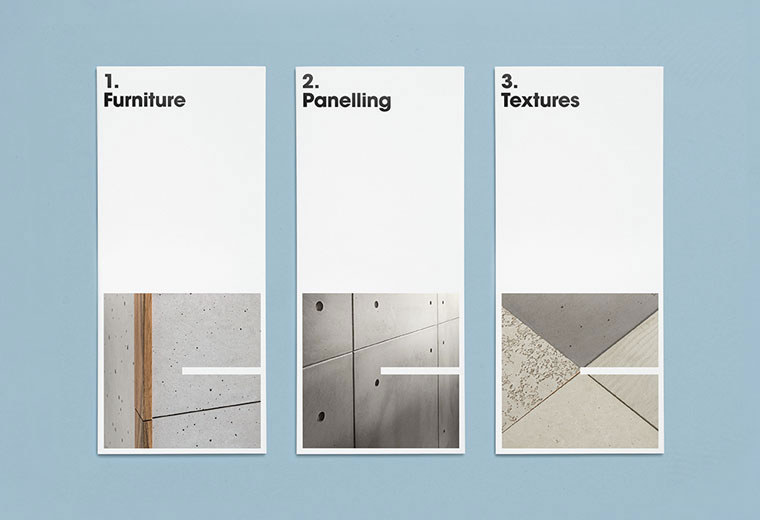
The square symbol references the square panelling of the product; while the identity’s ‘stark and bold application’ across the various touchpoints ‘reflects Brutalist design principles’, according to Design by St.
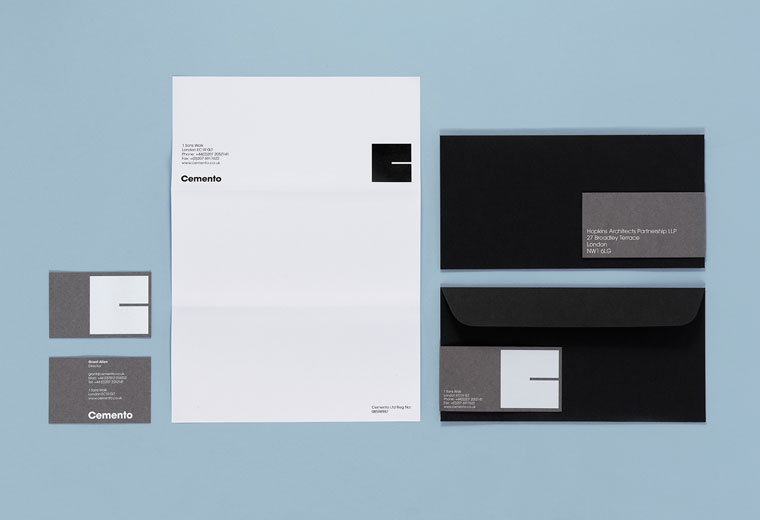
The consultancy was appointed to the project in the summer due to an existing relationship with Cemento’s founders.
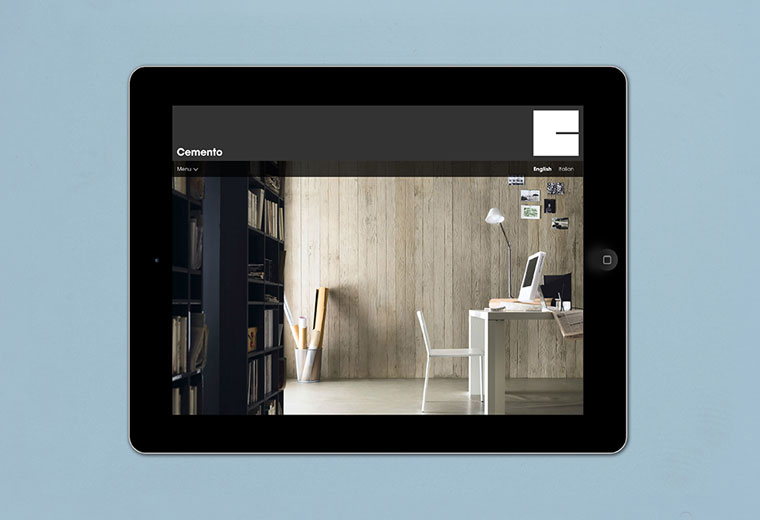
Steve Fenn, Design by St co-founder, says, ‘They wanted us to make sure it didn’t come across as a fancy Italian furniture brand – it had to retain the robust industrial quality and the idea of using huge, heavy, cement-cast cladding.
‘It also had to feel classy and high-end enough to sell to a design-literate market’.
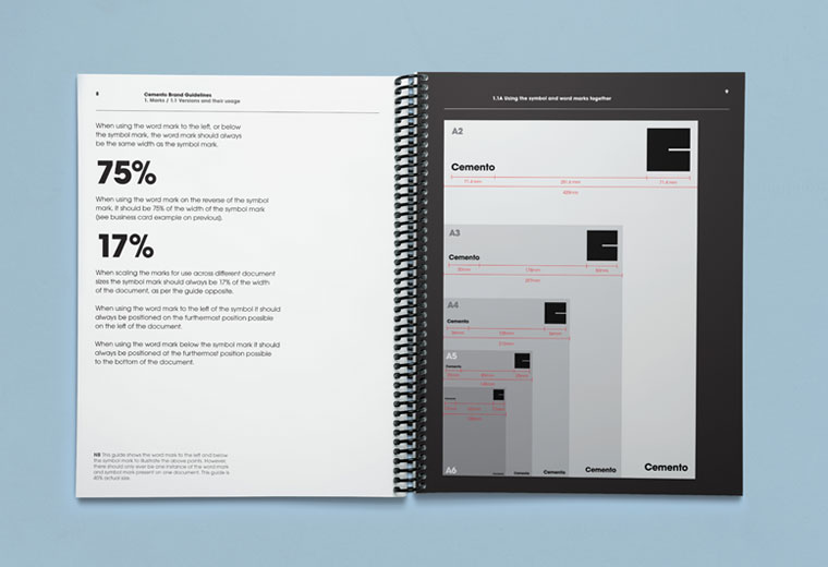
Design By St also created a comprehensive brand guidelines book for the identity’s application in future, on potential brand activities such as pop-ups, says Fenn.


LOVE IT…. GRRRR!