Lloyd’s Register launches new identity
Consultancy Off the Top of My Head has unveiled the new identity for business services group Lloyd’s Register.
The new identity will appear on the company’s website, protective clothing and signage from today.
Lloyd’s Register specialises in business services and risk management. The company has been operating since 1760 and recently reached turnover of £1 billion. The redesign is, in part, a reaction to the company’s latest financial achievements.

Off the Top of My Head was tasked with creating an identity that acts as a linking device for the whole business group and to make the company’s visual presence more suitable for the online world.
Mark Stokes, group communications director for Lloyd’s Register, says, ‘We needed to refresh our brand to reflect these changes to the market, our customers, our employees and all our stakeholders − a brand that works in the digital age.’
The new logo is minimalist in design and is inspired by the seal of approval Lloyd’s Register has branded its products with since 1884.
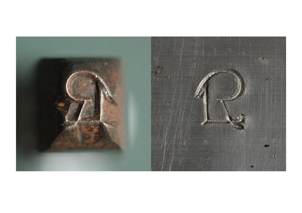
John Spencer, founder and creative director of Off the Top of My Head says, ‘For years Lloyd’s Register’s clients have referred to them as LR, so we took inspiration for the new logo from the LR stamp.’
Off the Top of My Head first collaborated with Lloyd’s Register in 1997 and was sought out when it came to this new rebranding. The identity was jointly developed with Columns who also produced the brand guidelines.

Although the redesign of the Lloyd’s Register logo has been revealed today, according to Spencer, ‘The design will have to be implemented over a period of time due to the size of the organisation.’
Off the Top of My Head has an on-going relationship with Lloyd’s Register and is now working on improving its brand products.

Read this next


I quote like it, the one it replaces was certainly very old. The new one is very contemporary, which is great, but means that in 10 years it’ll need a rebrand again.
I can’t help but think they missed a trick though, why didn’t they just go all the way back to the beginning and use a very lightly modified version of the original stamp. That’s where the brand comes from after all.