NB Studio rebrands Almeida Theatre
NB Studio has created a new identity for north London’s Almeida Theatre, which aims to be ‘smart, relevant and provocative’.
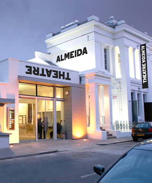
The Almeida Theatre opened in Islington in 1980 and this rebrand is the first update to its identity for more than ten years.
The rebrand follows the appointment of new creative director Rupert Goold, a director whose theatre productions include Enron and Earthquakes in London.
Nick Finney, director at NB Studio, says, ‘The brief from Rupert and [director of marketing] Jane Macpherson was fantastic – it was almost poetic, and full of phrases like “we will produce theatre red in tooth and claw.’
NB Studio was appointed to the work in October and undertook ‘an intensive period of immersion and briefing sessions with a small group of people at the theatre,’ says Finney.
He adds, ‘We highlighted the themes that resonated most deeply and would inform our work. It was clear that this was to be a bold re-brand rather than mere cosmetic enhancement.’
The rebrand aims to highlight a more provocative, opinionated theatre, and the identity takes its cues from editorial titles.
Finney says, ‘We realised that the way we were talking about the Almeida made it not sound like a theatre, in fact, the title of my presentation was “Not just another theatre rebrand”.’
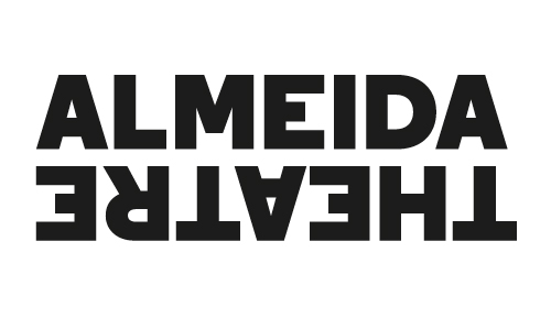
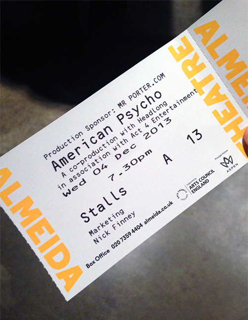
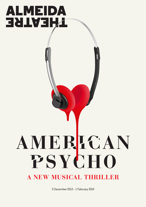
In the wordmark, the ‘Theatre’ is inverted in response, Finney says, to suggestions in the brief to be provocative.
He says, ‘If an audience is walking through the lobby and they see the word “theatre” is inverted, then they’re already prepared for a production like [just-opened] American Psycho the Musical.
‘It might look like a tricksy bit of graphic design, but it’s based on strategy.’
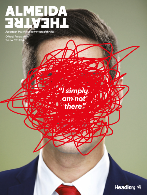
Other touchpoints include the theatre programmes, which are now being produced in a magazine format, again reflecting the editorial tone.
The new identity is launching this week with the preview of American Psycho, and NB Studio is working with the theatre to roll out the new branding in future communications.
The work was carried out by Finney as creative director, working with designers Jon Rowlandson, Kirsty Whittaker and Derek Man and account manager Tom Moloney.
Read this next


Like the marque although the type looks a bit Star Wars (think its the letter ‘R’) – works well on publications & tickets – although splitting the word marque and using ‘Theatre’ inverted looks clumsy as a standalone device. 🙁