How design affected the world of sport in 2014
The most memorable moment of the 2014 Brazil World Cup was undoubtedly Uruguayan striker Luis Suárez sinking his teeth into the shoulder of Italian defender Giorgio Chiellini.
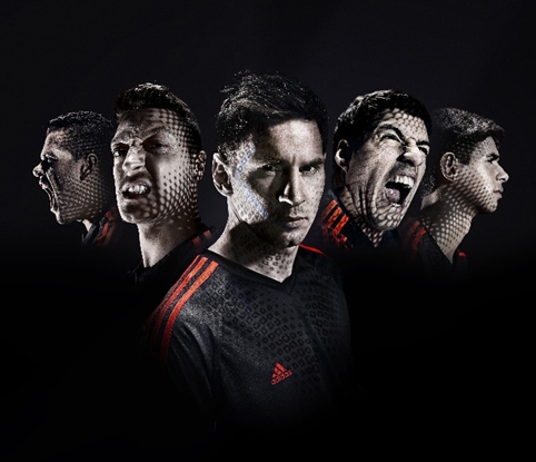
Although morally and sportingly reprehensible it was quite fortuitous for Adidas and its Fitch-designed World Cup campaign , which was already live and suddenly took on a prophetic quality, going viral almost instantly.
Some inventive reactions to this Adidas Luis Suarez billboard in Rio: http://t.co/ueMXxJ43t7 (via @guardian) pic.twitter.com/4XuamlhNJQ
— Design Week (@Design_Week) June 26, 2014
With a few notable exceptions the vast majority of memorable sporting designs were created for a handful of major events.
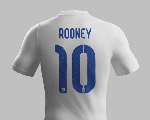
The World Cup saw Neville Body create a sharp-looking typeface for England’s kit, which was produced by Nike. Brody said he focused on “the intersection between flair and workmanlike reliability.” Regrettably, England’s team displayed neither in Brazil.
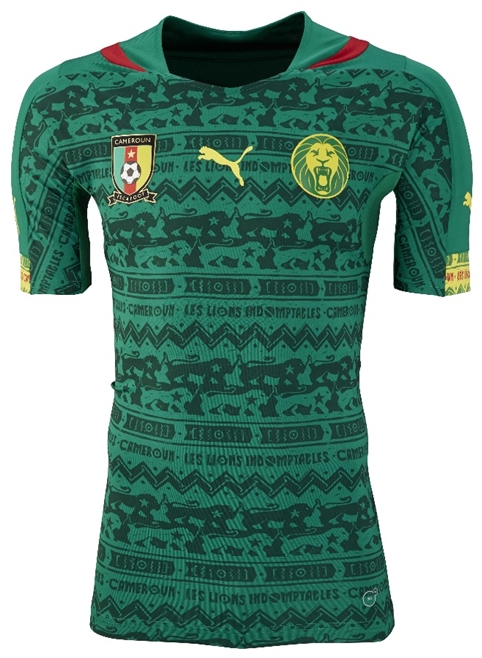
We took a look at all of the kit designs before the tournament and found that the Puma kits probably had the design edge, particularly the Cameroon home – check out the under pattern.
Back at home Glasgow hosted the Commonwealth Games, which brought with it a host of design briefs.
The logo for the games was designed by Marque Creative but the looks of the games, its identity as a whole and the implementation of the brand was developed by Tangent Graphic.
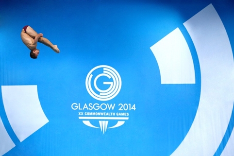
Tangent Graphic’s David Whyte told us: “We developed a visual style that was really immediate and striking – Glasgow is undoubtedly a bold city and its people are direct. We also wanted to convey a sense of style for a modern European city with a thriving arts and creative scene.”
In what was to become known as The Summer of Sport the Tour de France came to Yorkshire, which saw residents paint the town yellow and presented opportunities for designers.
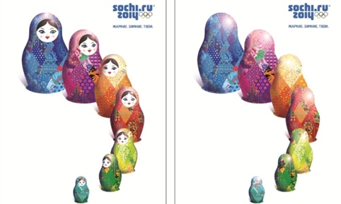
The 2014 Sochi Olympic Winter Games arrived with a political snowstorm – Fiasco Design created an unofficial map showing the kind of things Russia didn’t really want to be drawing attention to. This aside, Interbrand had designed a flexible identity system for the Games, which created a tapestry effect based on styles of craft from 14 regions across Russia.
We took a trip to the newly re-opened Olympic Museum in Lausanne, Switzerland to see how other Olympic cities branded their Games.
Meanwhile 2014 was also preoccupied with looking to future events – the Rio 2016 Olympics, the Russia 2018 World Cup and a new event, Baku 2015 1st European Games.
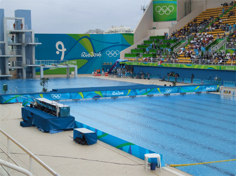
The Rio 2016 branding was unveiled. It was designed by Rio’s in-house team and combined the ‘motion and performance’ of Dalton Maag’s Rio 2016 Olympic typeface and the “contours” of the Rio 2016 Olympic and Paralympic logos. We were also introduced to the Olympic and Paralympic mascots, which have apparently been born out of an explosion of joy. They were subsequently named by the public as Vinicius and Tom.
We looked to the next World Cup, which is to be hosted by Russia in 2018. Its branding has been designed by Brandia Central, a specialist in football tournament branding. The design drew on a range of references – everything from the Sputnik spacecraft to Russian icon art techniques.
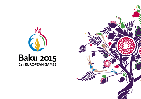
The first ever European Games will be held in Baku, Azerbaijan in 2015. A logo was created by Azerbaijani designer Adem Yunisov and comprises several components including fire and water, the Simurgh – a mythical flying creature – and the pomegranate fruit. SomeOne worked on a series of pictograms and further brand activation creating a series of organic shapes inspired by the pomegranate tree, which symbolizes unity in Azerbeijani folklaw.
World Rugby was given a new identity by Futurebrand and the design garnered a mixed reception. It saw a rugby ball logo replaced with a stylized “W” shape.
In recent years domestic football clubs have come under fire from fans by not being properly consulted on redesigns. Football fans are notoriously sentimental and nostalgic and these projects have proved quite political, lessons, which West Ham and QPR appeared to have learnt when they sought to bring fans closer to the process.
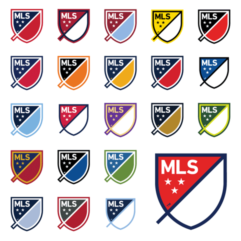
How about this for an identity system though. Major League Soccer introduced an adaptable crest system, which could be adopted by all the teams in the league and used in conjunction with their own club badges.
Although the legitimacy of the ceasefire football match held between allied and German soldiers has been questioned in recent days, it was deemed an act of humanity worthy of remembrance.
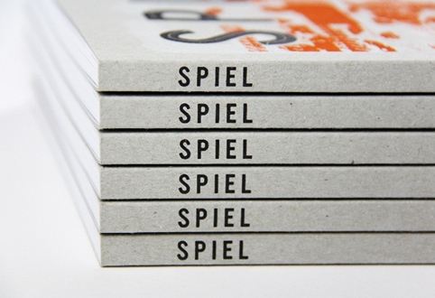
Finally, a lovely redesign of Spiel magazine proved that not everything in sport has to have a sport look. The football and visual culture magazine was relaunched with some helop from OWT Creative.
Read this next

-
Post a comment


