Online community DeviantArt rebrands to “bleed and breed art”
Moving Brands has created a new identity for DeviantArt, an online community that allows users to share and discuss artworks.

Deviant Art was set up in 2000 as a service for people who wanted to share modifications to computer applications and now has 32 million international registered users.

Moving Brands says it was approached to work on the rebrand in order to “redefine [DeviantArt’s] core beliefs to enable growth”.
According to DeviantArt chief executive Angelo Sotira, the new identity is based around the idea that the platform should “bleed and breed art”.
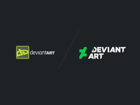
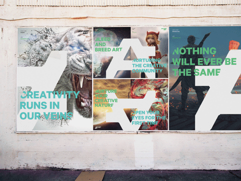
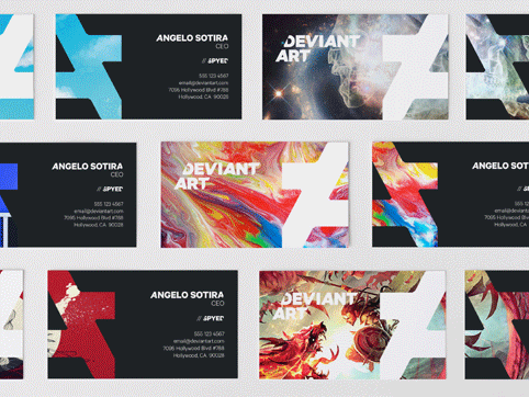
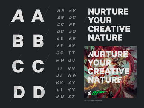
The new logo is a progression of the original DeviantArt dA mark and shows an “A” letteform that has been cut into. Sotira says: “A great thing about our symbol is that it can tessellate to form a beautiful pattern. It is particularly powerful because, when the symbol tessellates, it allows the two ‘As’ to become clear.”
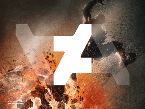
The symbol can be used with the DeviantArt wordmark, which has the letterforms cut at a 62º angle. This 62º cut reappears in type used on the DeviantArt website, which is trimmed to replicate the logo.
The rebrand uses the Calibre typeface, by type foundry Klim, with capitals used as frequently as possible.
Moving Brands also created a fully customised icon set, which can be used on the DeviantArt website and app. Symbol crops are used to create containers for content.
For the brand colour, Sotira says: “There is no question that DeviantArt is green. We considered every shade of green imaginable before deciding unanimously on the bold, vibrant ‘DeviantArt Green’ you see now.”
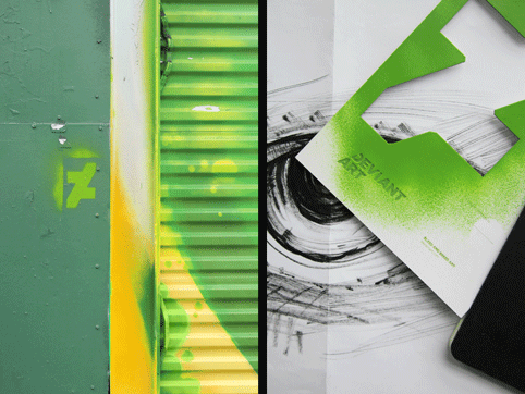
Sotira says the green will be used “selectively rather than pervasively” and will be supported by a neutral palette of greys – “chosen specifically for their qualities to showcase art”.
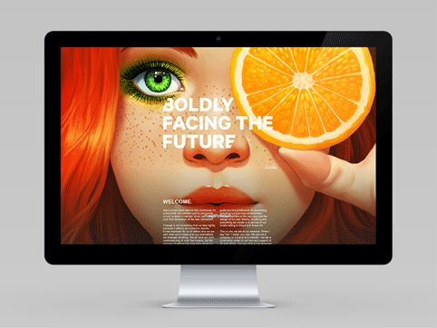
Moving Brands has also created the first DeviantArt app, which will launch on 10 December. The consultancy says the app design was “purposefully designed in tandem with the rebrand” adding: “We set the foundation of the user experience and UI with wireframes and motion studies that applied the look and feel of the brand system into the behaviours of the mobile experience.”


Read this next


“It is particularly powerful because, when the symbol tessellates, it allows the two ‘As’ to become clear.”
It’s really nice but what is the purpose of needing ‘Two A’s’ ?!
It’s a backwards dollar sign! $ (the color’s even green! just like money, too! search Google images for “money sign” and voila, backwards version of new DeviantArt logo!)
It’s a Z!
It’s an inequality sign! =/=
It’s a stolen logo! platzkart.ru
Alright, so in the end, this logo spells: money (DeviantArt making money off of those ads they tack onto our art), boring (ZzzZZzz, they made it so simple over half of their own users couldn’t figure out what it was), inequality (DeviantArt couldn’t even consult the stellar artists on their site about this logo, which means they mean absolutely nothing to DeviantArt’s staff), and theft (DeviantArt: purveyors of art theft — anyone who’s been there for 10 years would know what I’m talking about).
I don’t think DeviantArt’s ever shown so clearly how completely removed they are from the quality artists that populate their site.
It’s a real mess. Awful.