Parker Williams refreshes Pop art-inspired Pomegreat juice
Parker Williams has rebranded pomegranate juice brand Pomegreat, developing its Pop art style pomegranate image more than a decade after it designed the original.
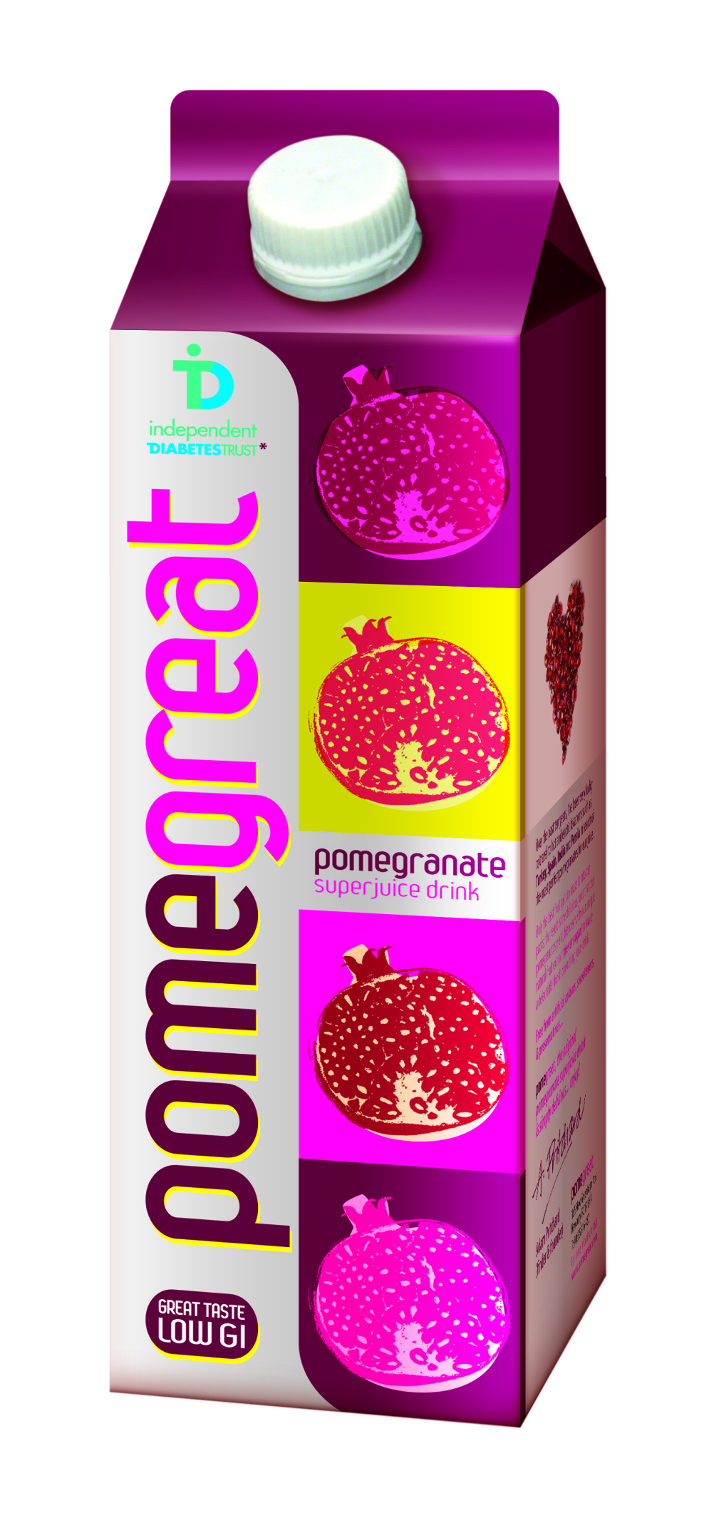
The consultancy says that the new design builds on the visual equities originally created by the agency – a vertical logo and “a series of pop art- inspired illustrations of pomegranates in bright, clashing colours to create on-shelf standout”.
The new pack also shows the drink’s low GI index and highlights Pomegreat’s partnership with the Independent Diabetes Trust, to emphasise the juice’s health benefits, according to Parker Williams.

Parker Williams says that it was approached following a slide in sales, which occurred after an interim redesign by another consultancy.
Parker Williams, creative director Jo Saker says: “We went back to the brand’s roots to take what we knew were successful elements, and gave them a contemporary update.

“We wanted to ensure the brand reminds customers of all that is innovative and distinctive in the brand’s heritage and that the pack stands out in an aisle full of photographic fruit images.”

-
Post a comment


