Pearlfisher creates ‘childlike’ sweet packaging
Pearlfisher has created new packaging for The Natural Confectionery Company, which aims to reflect a ‘childlike and inhibition-free curiosity in the world’.
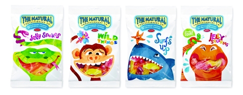
The consultancy says the new packaging depicts a ‘strong, ownable and illustrative world’, aiming to create better on-shelf standout and remain relevant to a wide age range of consumers.
Natalie Chung, creative director at Pearlfisher, says, ‘We have taken the playful spirit of the original illustrations to create a more natural, yet contemporary style.’
Pearlfisher created two new characters for each pack, and used a product window to allow the customer to see the sweets through one of the character’s mouths.
The packaging uses a predominantly white colour palette to reflect the natural qualities of the product, and incorporates colourful elements to reflect the fruity flavour.
The Natural Confectionery Company senior brand manager Jodie Bates says, ‘The design highlights the delicious natural qualities of our products while also retaining the spirit and humour of the brand.’
The new-look packaging is rolling out this month.
Read this next

-
Post a comment


