A new look for the London Housing Foundation
Off the Top of My Head has rebranded the London Housing Foundation, a charitable trust which funds and assists initiatives to reduce homelessness.

London Housing Foundation encourages new ideas from organisations working in the London homeless sector, identifies gaps in services and develops new services around them, provides consultancy to organisations which are closing or merging, and publishes practice guides and surveys of the sector’s finance and service delivery.

Off The Top of My Head founder John Spencer says the consultancy was appointed through a three-way credentials pitch in July last year and was tasked with creating an identity which better reflected LFH’s values and could increase the visibility of its work in the homeless sector.
‘Everyone who knows London Housing Foundation refers to them as LHF, so the new logo focuses on their initials,’ says Spencer.

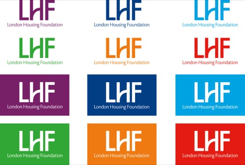
He adds, ‘Its crisp, confident and optimistic design was inspired by the guiding principle behind LHF’s funding decisions to “support and enable both organisational and individual transitions.” The idiosyncratic letter H is an extraordinarily simple graphic interpretation of innovation, transformation and change’.

As well as the new identity Spencer has designed a favicon, the latest edition of Atlas, (the LFH directory of services for homeless people in London), delivered a set of guidelines and produced materials for the brand launch in March.
-
Post a comment


