BrandMe designs Foster’s Radler lemon lager
BrandMe has created the packaging designs for Foster’s Radler, a 2 per cent ABV lager cut with lemon juice.
The consultancy was appointed by brand owner Heineken on the back of its work on the Foster’s core range, and premium variant Foster’s Gold.
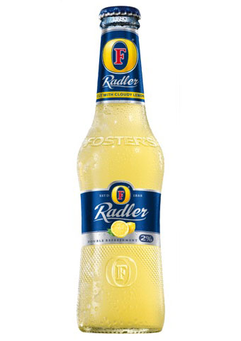
John Wynne, creative director at BrandMe, says, ‘The bottle design is similar to Foster’s Gold, but there’s a flattening around the waist to accommodate the label, and the textured dots – which are based on the Foster’s logo – are moved further down the bottle.’
Radler – which takes its name from the German word for cyclist – is a common beer variant in Europe, inspired by mixed beer/lemon drinks cyclists would prepare for themselves in the mountain.
The typography and lemon graphics on Foster’s Radler are taken from the Heineken brand guidelines, says Wynne, and are also used on other Heineken Radler varients.
Wynne says, ‘Part of our job was to use this while giving the Foster’s brand as much equity as we could.’
Clear glass is used to highlight the cloudy nature of the product, to provide standout against other bottled beers.
Foster’s says the new Radler lager ‘meets a growing consumer need for a lighter, more refreshing beer sought on moderate drinking occasions.’
Foster’s Radler is set to launch in bottles next month, with on-trade possibly to follow.
Read this next

-
Post a comment


