Designhouse rebrands travel retailer Nuance Group
Designhouse has created a new identity for travel retailer The Nuance Group, which is set to roll out internationally.
Designhouse has previously developed retail designs for Nuance, and was tasked with creating a new identity around a year ago.
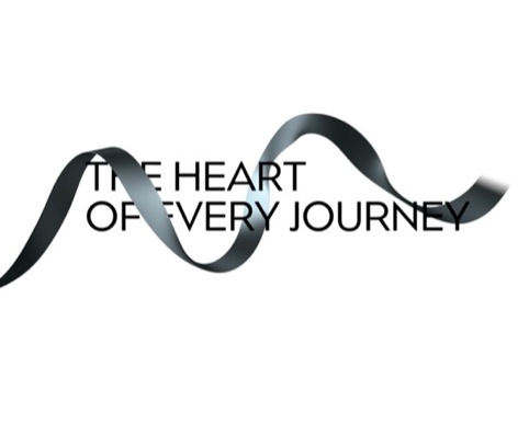
The consultancy says the new branding has been developed around Nuance’s aim ‘to be at the heart of every journey’.
The positioning and identity were developed following a series of workshops around the world. Designhouse interviewed Nuance’s clients, airport partners and suppliers, as well as the company’s employees.
Designhouse says, ‘The employees not only came up with ideas but also worked on what the new values meant, and how they could be brought to life throughout the whole organisation.’
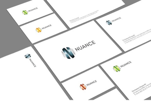
The new identity is based around a ribbon, which can be used in different applications in different media.
When used in the Nuance logo, the ribbon forms a globe and an initial ‘N’.
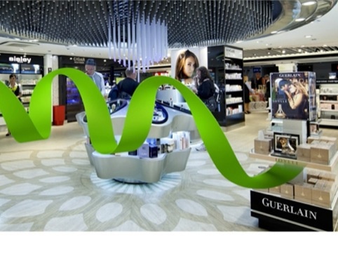
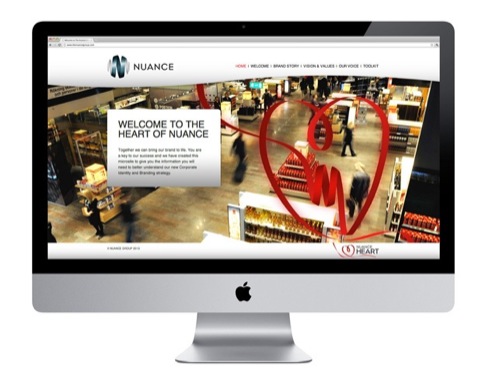
As well as featuring as the standalone mark, the ribbon can also be used in print, online and in retail applications. Designhouse says it represents ‘a retail journey’.
The new branding operates as a global identity, and each region has been given an individual colour, for example Europe is green, and North America is blue.
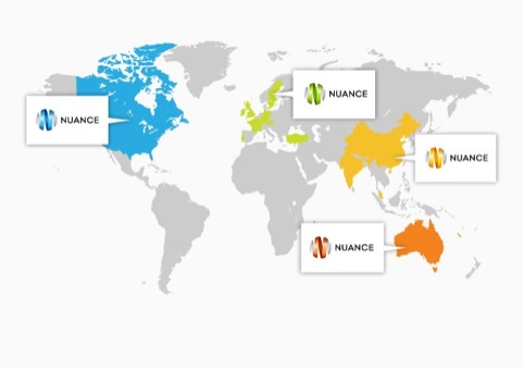
Designhouse says, ‘They wanted to be a global brand with a local touch.’
Read this next


A neat solution and great to see Designhouse back in the press (but I am biased!).