To The Point creates Periodic Table identity for Matter PR
To The Point has created the identity for new PR agency Matter PR, developing branding based on the Periodic Table.
The consultancy had worked with Matter PR managing director David Reid previously and was brought in to help explore names in early January.
Matter PR specialises in working with science and engineering organisations and the identity had to resonate with these potential clients.
To The Point creative director Kevin Cox says, ‘The word “matter” suggests something of importance but also pays a nod to the science industry, as matter is the physical substance of everything. It implies that this agency creates work of substance and importance, that communication matters.’
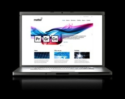
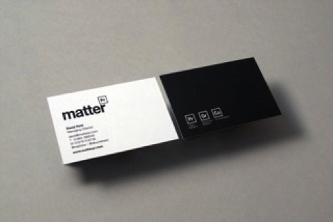
The identity features a square from the Periodic Table, containing ‘Pr’, (actually element Praseodymium) but reappropriated as public relations. The same motif is appropriated across communications with different letters within the square.
Solid, liquid and gas states have been evoked with photography, to demonstrate ‘expertise in the science sectors’ says Cox.
Read this next


What incredibly insightful and original design.
However, I can’t help but think I’ve seen something similar somewhere – http://i.imgur.com/Kd7Tolv.jpg