Brandhouse helps shape Robinson’s new Squash’d product
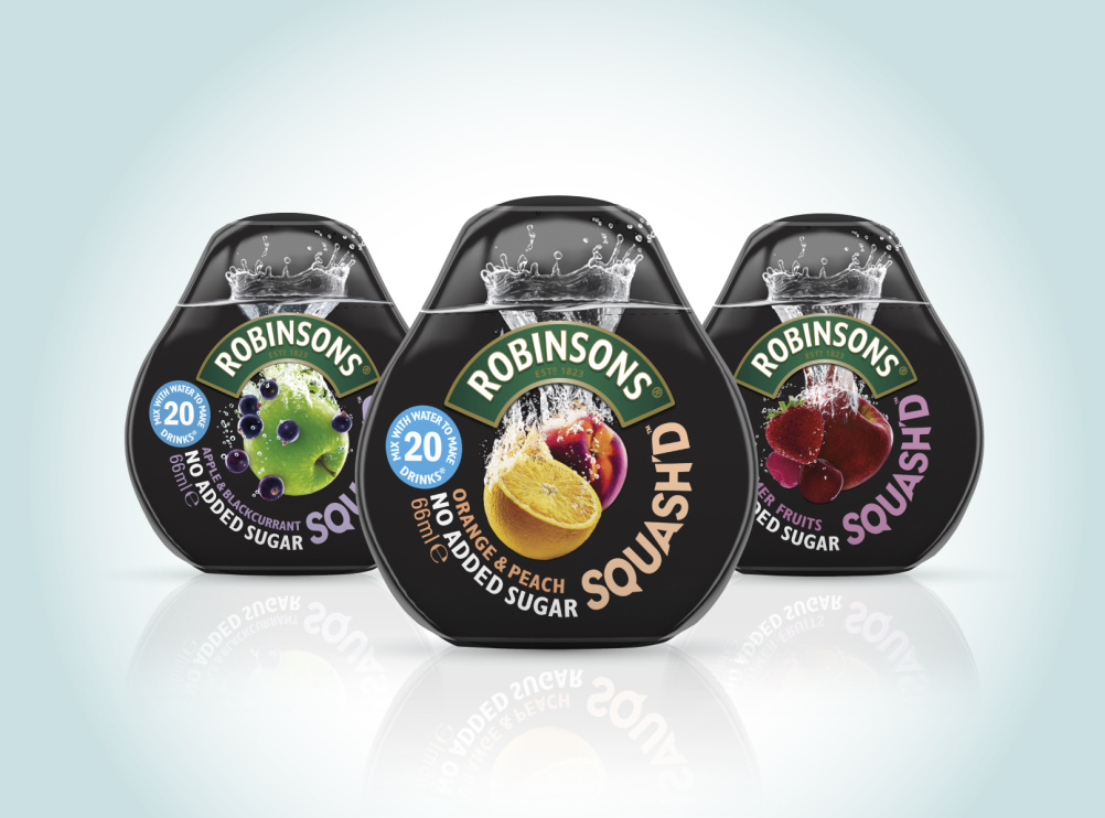
Brandhouse has designed the identity of new Robinson’s project Squash’d, a super-concentrated drink with packaging designed by Studio Davis to fit into the palm of your hand or pocket.

Brandhouse was appointed last year by Britvic which it has been working with for 20 years.
It was tasked with creating an identity for the product which is designed to increase sales of squash by targeting ‘on the go’ young professional customers – a demographic aged 25-35.

To match the lifestyle of this demographic ‘the brand needed to feel like a modern accessory’ says Bronwen Edwards, creative director at Brandhouse.
Each Squash’d bottle makes 20 drinks and the product, comes in three flavour variants: Orange & Peach; Apple & Blackcurrant; and Summer Fruits.

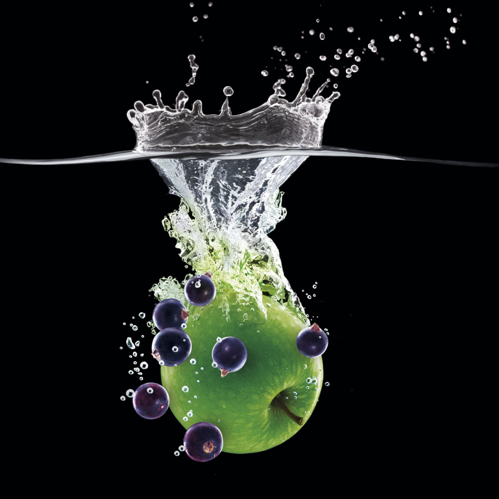
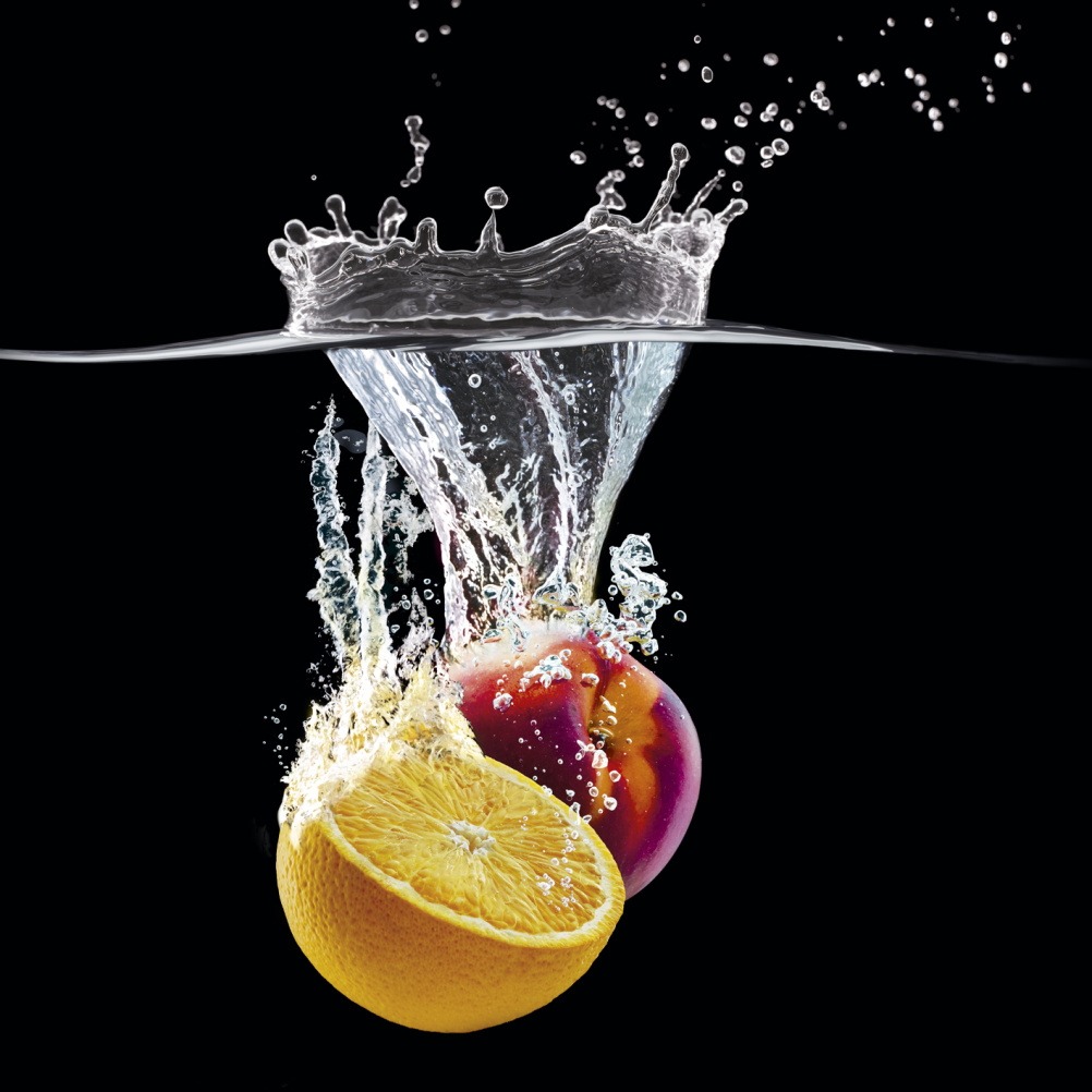
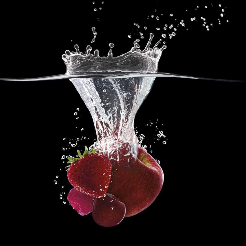
Photography has been commissioned which ‘had to work hard on such a small canvas, to look really tasty and refreshing and communicate quality’, says Edwards.
The black background has been integrated to increase this effect and to reinforce the positioning for adults.
‘The black punches out the colours of the fruit, allows the water bubbles to be visible, but crucially it is unique in the squash category,’ says Edwards, who adds, ‘This truly is a design where every millimeter counts.’

Copy on the bottle instructs buyers to ‘Flip, squeeze, click shut, enjoy’.
-
Post a comment


