Yellowdoor takes on Clarks Originals rebrand
Yellowdoor has been appointed to rebrand Clarks Originals for the spring/summer 2011 range, creating a campaign aiming to emphasise the brand’s ‘individuality’ and collaboration with music.
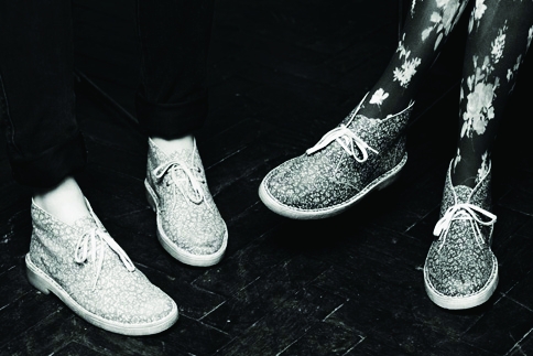
The project includes commissioning a new series of photographs and opening a pop-up store on London’s Regent Street next week.
Yellowdoor was appointed to the project without a pitch in October last year, having worked with Clarks for more than 13 years.
The consultancy was briefed to create a unique brand image for Clarks Originals, which strongly referenced the brand’s historical associations with music. It has maintained the Originals red logo, which will be used ‘within the imagery as a brand identifier’, according to Yellowdoor creative director Rosarie King.
King says, ‘We’ve worked on Clarks Originals for many years, but this season we decided to give them a stronger identity. We’ve created new brand images with the black-and-white photographs and a stronger association with music.’
The work will be seen on in-store graphics, a new Clarks Originals website, posters and the pop-up store, which will be open from 7-20 February. The campaign imagery will roll out next month.
Read this next

-
Post a comment


