Bierut redesigns Billboard
Pentagram partner Michael Bierut has redesigned music industry trade magazine Billboard, creating a new identity, a new editorial format, and new-look chart-rankings pages.

Distributed internationally, US-based Billboard was established in 1894 and claims to be one of the world’s oldest trade magazines. It has carried its signature ‘Hot 100’ chart rankings since 1958.
Over the past decade it has moved from being a trade newspaper to taking on a colour magazine format, and Bierut was brought in to redesign it in this format, working alongside Billboard creative director Andrew Horton, editorial director Bill Werde and editor Joe Levy.
Bierut has created a new identity for Billboard, which is set entirely in lower-case, and drops the coloured circles from the previous logo (although these are still used on the Billboard website and in marketing).
This is intended to make the print version look immediately more ‘serious and grown-up’ according to Pentagram.


Inside the magazine, sections have been reorganised and restructured, and page layouts are opened up, with graphs, pull-quotes and other data appearing in the margins.
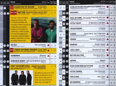
A major part of the project was remaking the magazine’s showcase charts, to be more easily understood.

Bierut says, ‘For me, helping to redesign the Billboard charts was the ultimate information design challenge.’
The charts have been redrawn to appear at a larger scale and across more pages. Black and white replaces the previous colour-coding in the charts, and more spacing has been introduced to make them easier to read.
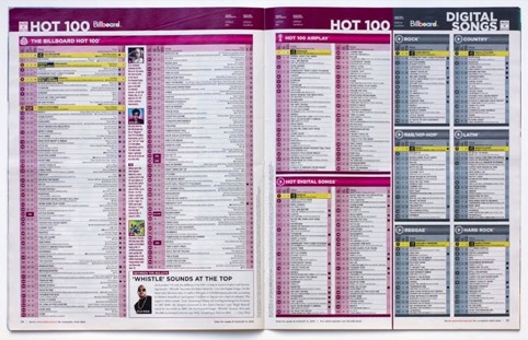
Weekly record rankings have been reorganised, with earlier rankings moved to the left and coloured grey, leading up to current rankings in black. A new ‘Coda’ information graphic charts movement and other trends.
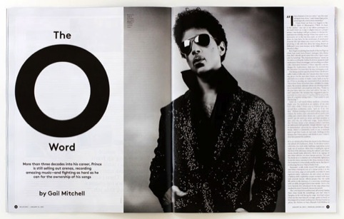
The new Billboard is launching with its 26 January edition, featuring cover-star Prince.
Read this next

-
Post a comment


