A new look for the Sunday Times
The Sunday Times is introducing a new look this weekend that aims to bring a ‘brighter’ feel to the newspaper.

The work – which has been created in-house – is billed as a ‘light-touch refresh’ and builds on the newspaper’s 2008 redesign, which was led by News International art director Al Trivino and introduced colour across all the newspaper’s sections.
Pagination and name and number of sections remains the same, as does the cover price. Sunday Times editorial director Eleanor Mills says, ‘Readers really love the Sunday Times, it’s something we get from all our focus groups – so we weren’t having any complaints from readers.
‘It’s evolution rather than revolution and it was really a case of looking at the design and freshening it up.’
This new work brings in a new font and changes the use of images – both of which aim to increase the amount of white space in the design.

The Glosa typeface replaces Greta as the body copy font. The Sunday Times says Glosa is ‘a delicate font that is highly readable at small sizes’. It says this allows the design to ‘create more white space on each page for an easier read’.
White space is also increased around images and graphics to ‘increase their impact with readers’.
This system is used throughout the newspaper, from the main section to the supplements including Culture.
A new identity system is introduced for the three lifestyle compact sections – Travel, Home and Driving & Technology. A line logo replaces previous block mastheads and the line colour is used throughout each section.
The Sunday Times Magazine changes format, becoming taller and slimmer. A new masthead is introduced – which is a reworked version of the original masthead.
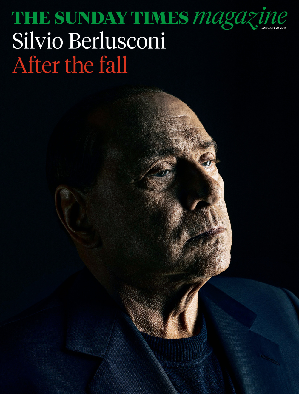
Mills says, ‘For me the real design ace is the Sunday Times Magazine – where [art director] Matt Curtis has gone back and taken inspiration from the original designs from 50 years ago. It’s retro cool with a modern, fresh take and it’s one of the last magazines on Fleet Street that takes photojournalism seriously.’
The design has been led by Sunday Times art director Gordon Beckett, working with former deputy art director Henry Nolan. Sunday Times magazine art director Matt Curtis led the redesign of the magazine.
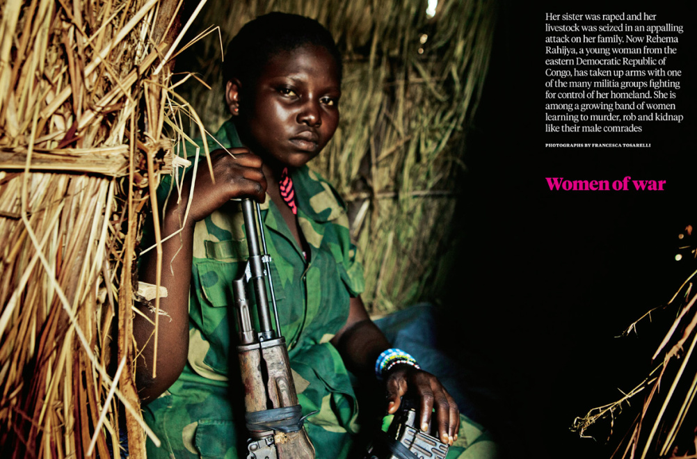
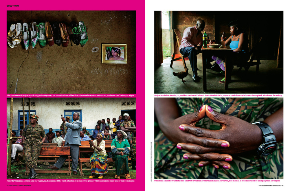
Women soldiers in the Democratic Republic of Congo feature from the Sunday Times Magazine

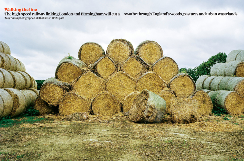
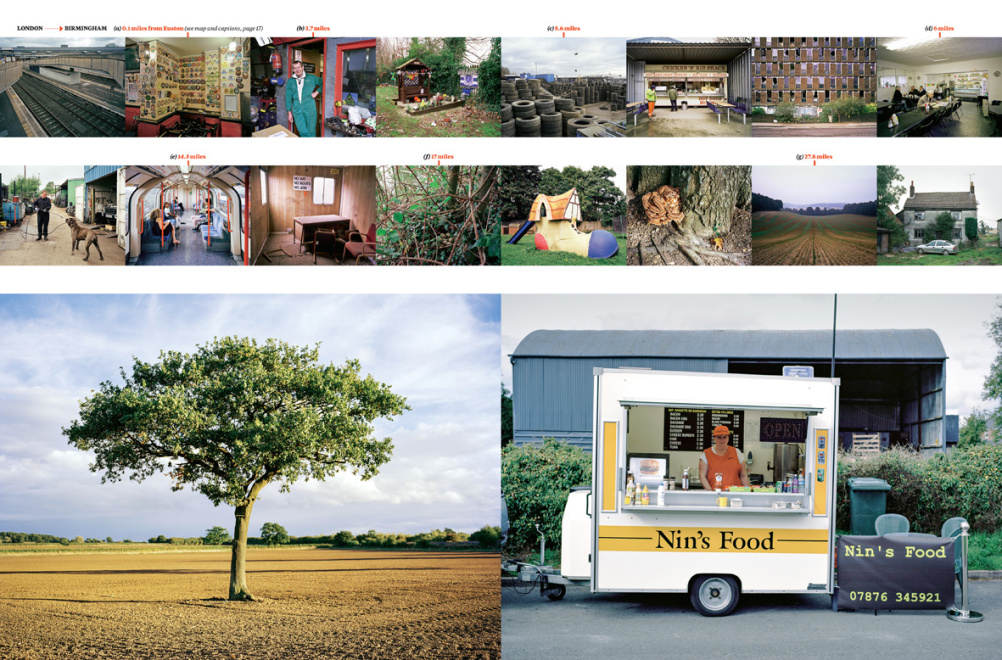
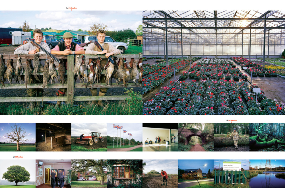
Path of High Speed 2 railway feature from the Sunday Times Magazine
Read this next


Hmmm, I’m not sure. I used to work for a corporate comms agency and the new Culture and Home section covers look fairly similar to the work we used to produce. Granted, there’s a limit to what you can do with a cover, but this doesn’t feel as if they’ve gone any where near that limit.
I’m also disappointed not to see all three titles follow the same style (although, I would favour the Magazine’s cover style over the Home and Culture section’s look).
Oh, and the kerning on H O M E really bugs me.
A difficult project — riddled with complexity… but it’s not, on first view, as compelling at the brilliant work from The Independent.
Which should be a worry for The Sunday Times.
Culture change fine but Home …? Nope for me. Looks down-market. Trying to hard and will date.
Poor Show from The Sunday Times. Seriously need to up their game. This work looks trapped in the previous decade.
I don’t like the design and the change of content..
The design style is far too serious, it is not a political magazine.