Advice on branding – keep it simple, stupid
SomeOne design director Lee Davies promotes the power of simple branding.

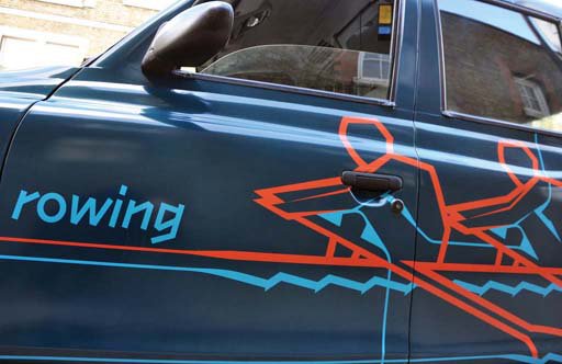
Source: bdesham
Lego bricks
In 1949 the square and circle were transformed. Ole Kirk Christiansen and his team had made a breakthrough that would change childhood forever.
No longer did they see the square and circle as flat and boring, they elevated them to something greater. They were now colourful. 3D. But the best part of their breakthrough? They could be bound together – hence their rather uninspiring early name — Automatic Binding Bricks.
These were, of course, later renamed Lego bricks and now litter the playroom floors of children (and adults) across the globe. What Lego has managed to do over the past 55 years is nail its brand vision to ‘inspire and develop children to think creatively’. It encourages play and it does it brilliantly.
For me the best part of Lego is the simplicity. Sure you can buy the Death Star, eagerly follow the instructions whilst the rest of your family nod off after christmas lunch and voilà, the final model will look great. The real fun though is when you litter the floor in colourful plastic pieces and build whatever your mind can muster.
Lego is a perfect example that a fixed framework of elements can be tuned and adapted to suit a wide spectrum of applications. It allows you to do more. This is something that is vital when creating a new identity for a brand, or even adding to an existing brand. Brands are living things, they don’t stand still in the same suit in the same environment everyday.
Brands are rarely straightforward, they are complex and multifaceted. We absorb brands everywhere in an ever increasing manner of ways. When developing a brand that might have a complex offer for a complex world, what’s the best thing to do? Keep it simple.
If you develop a simple framework, people won’t be confused by it. It’ll be easy to understand and implement. They can see the potential in it and will play with it. They’ll do more with it.
Traditional guidelines will often set out to dampen creativity: don’t do this, don’t do that, use it only at this size, in this place, only use these colours. I’m more of a fan of providing a book of inspiration. Show people what can be done within the framework set out before them and you’re back in Lego territory. It’ll hopefully inspire people to think creatively and develop the brand.
Sometimes you have to deal with a complex brand world. When we worked with LOCOG to develop pictograms for the Olympic Games, the London 2012 Brand was indeed complex. The logo was born out of a chaotic series of intersecting lines. These lines inspired a series of patterns that were coloured in a bold and energetic set of colours. Everything started to look too busy, too confusing and people were turned off.
Source: Taxi Advertising
SomeOne’s London 2012 Olympic pictograms
To develop the pictograms we stripped back the complexity and took the element that informed the entire identity. The line.
Inspired by Harry Beck’s London Underground map the lines were set at right angles. Like the Tube map, they ran either horizontal or vertical. When these lines intersected, that’s where the magic happened. It was in this space that the pictograms were formed. It was a simple system that still lived in the original London 2012 world, but more importantly, it was a system they could do more with.
It wasn’t a set of fixed assets that other designers were then tasked to badge on every surface they were briefed to design. They were encouraged to play within the system. Take a line drawing of a London landmark, for example, and add extending vertical and horizontal lines and it’s now ownable.
One Nottinghamshire gent has developed a clever system without the need for design studios or brand consultancies. He has harnessed the ability to do more with his brand signature. The real beauty is its simplicity.
Draw some varied-width stripes butted together, colour them using a well crafted, beautifully considered colour palette and you’ll instantly know his name. It is, of course, Paul Smith.

What Smith has with his stripes is different to other fashion brands that are famous for a pattern. Like Louis Vuitton’s famous monogram pattern, Burberry’s check or Eley Kishimoto’s flash. All fantastic and instantly recognisable – albeit rather one-dimensional.
Where the Paul Smith stripes differ is that they can flex and adapt. They change colour. They can swirl. They overlap. You can recolour a zebra with them. The stripes have become a powerful branding tool. Whatever it is they cover, be it a mini, a wallet or a football. You know it’s Paul Smith. All of this and not a logo in sight.
Simple frameworks that have a capacity to flex will allow people to play with a brand, allowing it to distinguish itself. It allows the brand to do more, it can evolve and expand and the visual identity can evolve and expand with it.
It is this idea of ‘doing more’ that is the most powerful. Invite clients to rediscover the art of play. Give them the tools to do more. Don’t simply tell them what to do and walk away, no one likes being told what to do.
Work with them to build them something useful and versatile. Install excitement and opportunity into them at the start of their brands new journey. Enable them to grow and adapt on their way to win with a flourish, with flair.
Lee Davies is design director at SomeOne.


Great article!
This is a great insight into how a great agency keeps on turning out great work. Great!
Shame the article is about implementing Identity Systems not Branding.
Stupid!
Great article 🙂 very interesting comments made.
Brilliant. I love a simple article that is just direct and to the point. No jargon. Its simplicity in how its written and communicated secretly emphasises the point even more.
Loved the article. Great use of real life examples to illustrate your argument.