Yorkhill Children’s Charity rebrands – All Better
Consultancy Good has rebranded Yorkhill Children’s Charity, renaming it from Yorkhill Children’s Foundation.
The Scottish charity sought a new look following a broadening of its work, which comprises providing support to and enhancing the treatment of children and their families at The Royal Hospital for Sick Children at Yorkhill, Glasgow, and other hospital and community based services both nationally and internationally.
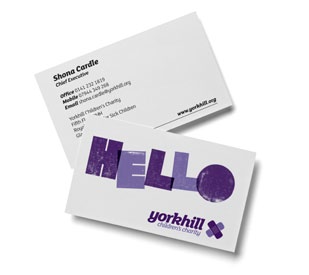
Shona Cardle, chief executive of Yorkhill Children’s Charity, says, ‘To match our expanded vision, we needed a versatile, bold new look that reflected our growth but still encompassed our core values’.
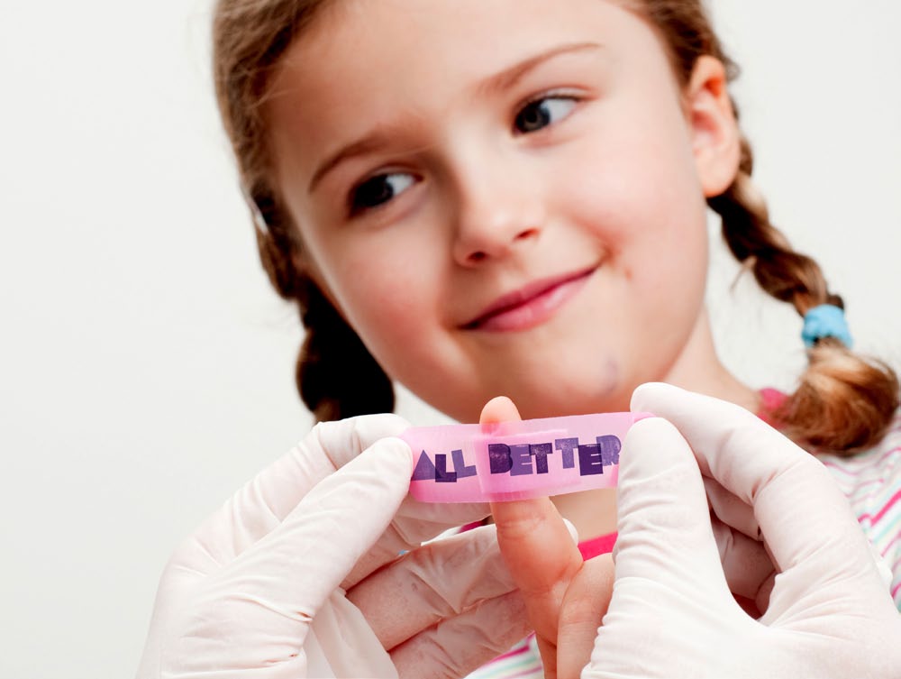
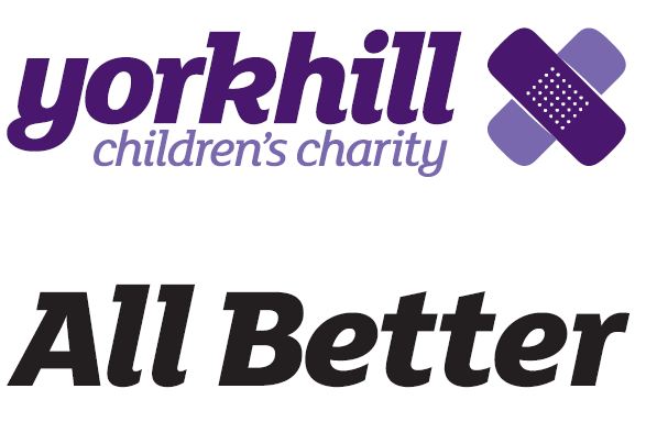
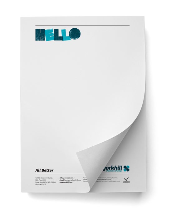
Good created a new logo for the charity based on an image of two crossed sticking plasters. The new strapline ‘All Better’ was introduced, and Good also brought in two new typefaces to be used across the branding’s various applications.
The strapline uses the charity’s new block-style typeface, shown in a number of different colourways.
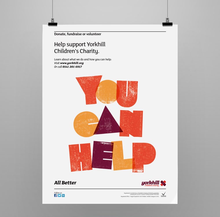
The new identity aims to ‘underline the charity’s key values of support, optimism and professionalism, with the slogan encapsulating the core of Yorkhill’s work’, according to a Good spokeswoman.
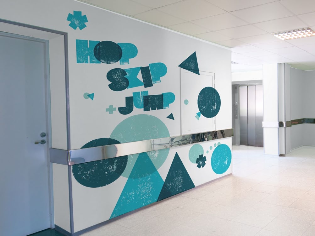
Chris Lumsden, managing partner at Good, says, ‘We’ve created something we know will work across all touchpoints, from Yorkhill’s new website to its fundraising communications and even on hospital walls. It’s reassuring and confident and will support the wide range of work the charity carries out now and in the future’.
Read this next

-
Post a comment


