L&Co rebrands Association of the British Pharmaceutical Industry
L&Co has created a new visual identity for the Association of the British Pharmaceutical Industry (ABPI), the first time it has been revamped in 30 years.
The consultancy was appointed to the project in December 2010 following a three-way credentials pitch.
L&Co initially worked with Hensley Partners and the APBI to create new brand positioning for the organisation, before developing a new visual identity.
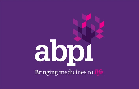
The identity uses a bold purple and pink colour palette and incorporates the new strap-line, ‘Bringing medicines to life’, along with a geometric tree symbol ‘inspired by the symbol in eastern medicine’. The grid-system of the tree icon aims to represent the idea of collaboration.
Paul Barlow, L&Co founder and creative director, says, ‘With the pharmaceutical industry you have reflect the idea of being open and collaborative, but its underpinned by science so you can’t go too touchy-feely. We really wanted to push the message of change so we used bold colours underpinned with precision.’
Amanda Callaghan, ABPI director of communications, says, ‘We are very pleased with our new identity which better reflects what the ABPI and its members do in working collaboratively with all parts of the healthcare community to bring innovative medicines to practitioners and patients.’
The identity launches this week.
Read this next

-
Post a comment


