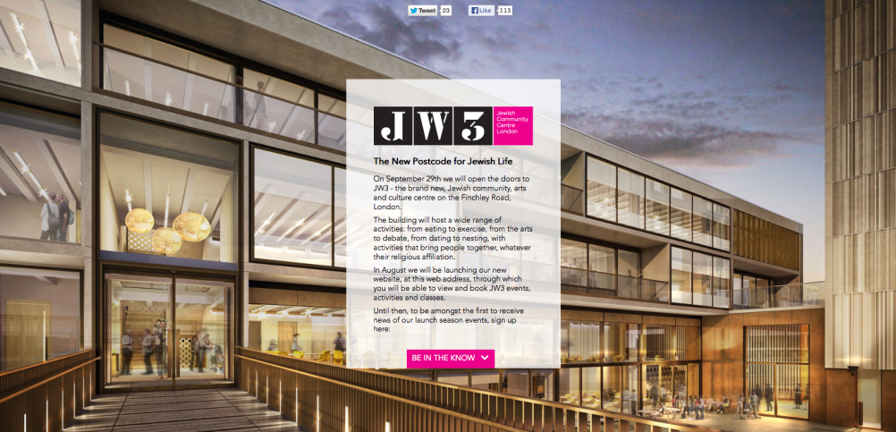
Identity for Jewish community centre JW3, by Pentagram’s John Rushworth
Pentagram partner John Rushworth has has created the name and identity for JW3, a new Jewish community arts and culture centre set to open in September.

The building, designed by architect Lifschutz Davidson Sandilands, will open on Finchley Road, London.
The name and identity is a play on Finchley Road’s NW3 postcode, as well as the tiled street signs found in the area.
A JW3 spokesman says that Pentagram was engaged to think about the centre ‘as a place for anyone interested in Jewish life’ and to consider ‘the location and building and to bring Jewish culture up to date’.
Rushworth created the name and identity, as well as the overall strategy and concept, before handing the project over to the client.
The Clore Duffield Foundation and private donors who backed the project had taken inspiration from the global Jewish Community Centres, which are popular in America.
Rushworth says that he was primarily brought in to work on the naming. He says the London centre was originally going to take the JCC name, but that he advised against it as the London centre offers a different type of experience.
‘It’s location and it’s relationship with the local community is the main purpose,’ according to Rushworth who adds, ‘The name is obviously a play on the NW3 postcode, which has a strong Jewish community.
‘There’s a particular type of street signage around the area – black and white ceramic tiles, so we’ve referenced that and the building; Modernist-style architecture which is a big part of the identity.’


Well out of context I like the stencil letterforms but the moment I saw this and the connection to the Jewish…community centre it reminded me of my trip to Auswitch. A heart breaking place. The JW3 looks harsh and like a prison uniform number. It seems very unfriendly for a community centre..unless the intention is to have subliminal reference to the past not to be Forgotten? http://commons.wikimedia.org/wiki/File:Prisoners'_Uniforms_with_Red_Triangles_of_Political_Prisoners_-_Museum_Exhibit_-_Dachau_Concentration_Camp_Site_-_Dachau_-_Bavaria_-_Germany.jpg
I agree with Sean, my first impression was that it was a holocaust memorial centre. It’s a stark identity for somewhere that celebrates Jewish community, arts and culture.
We will never forget; this was an opportunity to present a forward-thinking community, I think it misses the mark.
In principle the idea seems a good one. I had a look at the Finsbury street tiles. They look great. Like most things applied in the environment the surroundings help the overall feel. Brick work textures etc. Taken out of context it becomes stark. The letters and numbers on the tiles are really nice. For me it’s the stencil font that changes its feeling / meaning. It was pointed out to me for the dyslexics amongst us that JW3 looks like the word JEW. Again no idea if this is a deliberate visual play. But well if the client likes it then C’est la vie.
As mentioned before by others; the likeness to the stencil work on the camp train wagons and the stencil work on camp clothes is rather uncanny. A rather grim reminder of the past and not a more forward thinking mark. I don’t know if this was deliberate, subconscious or just a coincidence. And also with the JW4/JEW; weird coincidence?
Lovely architecture, but I think the mark missed it’s mark