JKR adapts Unilever logo for training facility
Jones Knowles Ritchie has designed the identity for Unilever’s Four Acres training facility in Singapore.
The Singapore campus is Unilever’s second such facility and the first outside the UK.
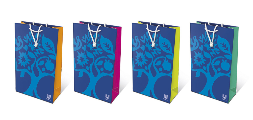
Elements of the Unilever identity – rebranded by Wolff Olins – have been extrapolated and repositioned in a tree form, which JKR says is ‘a tree of knowledge’ representing themes of ‘learning development and growth’.

JKR creative director Daniela Nunzi Mihranian says, ‘We were briefed to create an identity that would sit harmoniously next to the Unilever brand, and yet that would express the values and heritage of Four Acres.
‘We chose specific icons for their inherent meaning: the spark to symbolise catalysing ideas and talent; the bird to symbolise freedom to grow, and the sun to represent creativity and optimism. In addition, we crafted two figures that form the trunk of the tree, representing the power of human connections.’
The branding is being applied to a range of collateral and JKR remains engaged with the new brand for ongoing strategic advice.
Read this next

-
Post a comment


