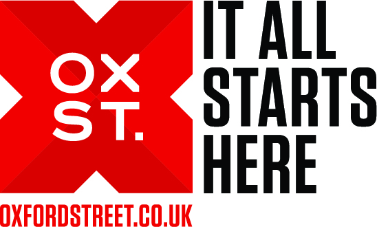
X marks the spot – a new identity for Oxford Street
London’s Oxford Street is set to launch a new identity, developed by Goosebumps Brand Consultancy, which uses an ‘X’ to ‘mark the spot’.

The new identity is based around the proposition ‘it all starts here’. It sees the Oxford Street name shortened to Ox St.
Goosebumps was appointed to work on the new branding by the New West End Company, and has looked to ‘reignite London’s love affair’ with the shopping street.
The branding, which is described by Goosebumps as ‘bold and unapologetic’, is primarily aimed at shoppers, but will also have a business-to-business role. It was developed following research with shoppers, retailers and other Oxford Street stakeholders.
Simon Cotterrell, strategic partner at Goosebumps, says, ‘We wanted to get the street to think of itself as not just the route from Centrepoint to Marble Arch, but also the 100m north and south. Then it becomes the world’s biggest mega-mall, with shops, restaurants and galleries.
‘The “It all starts here” line allows for flexibility, so it can be used with “lunch starts here”, or “Sundays start here”.’
Cotterall adds, ’The identity itself came from that. It’s minimal, bold and simple. The “X” itself is used in the word Oxford, it’s used on treasure maps to mark the booty and it also links to the “X” crossing outside Oxford Circus.
‘We’ve designed the identity with a lot of flexibility – in future it can be a window for ither images, it can be an outline, it can be used multiple times or it could have physical iterations.’
The new identity comes as Oxford Street is redeveloped for the launch of Crossrail – expected in 2018. NWEC is also aiming to create a strong brand for the area to counteract pressures from Westfield’s retail sites in east and west London.
The new identity will launch in a marketing campaign during London Fashion Week in September.


immediacy, great work!
Very simple but yet catchy logo! Definitely tells the tourists where it all starts from. Conceptually and visually in both sense works well.
How is it pronounced?
I can’t place exactly why but visually this identity reminds me of a charity campain which is ironic considering the corporate nature of oxford street. I’m not immediately convinced but will have to see it placed in context to comment further.
The idea is really good and I could see the graphic applications being bold and Iconic and fun. The one thing I don’t get is the abbreviation to OX ST. Its Oxford street and the abbreviation does’nt link. Surely the heritage is in OXFORD and getting the tourists etc familiar with that?…will we really go…I will meet at Nike Town on the corner of OX street?? But will be eager to see how its applied. Open minded on it.
The ‘X’ reminds me of the Cross Country brand identity. Saying that, I really think the branding is great, just unsure why ‘Ox’ has been used. In any rebranding of a place, I really feel that the branding should reflect the heritage and the culture of that place whilst instilling its future aims. It also appears the street has been renamed ‘Bull Street’. Subliminal comment on the raging nature of the place? Ox Street seems a bit of a cop out but the idea of transforming the Oxford Street into the heart of the city certainly has its appeal. Almost like London’s treasure. Just to add, why do some design agencies seem to use such pretentious sayings? Let the work speak for itself.