A new look for the Eurovision Song Contest
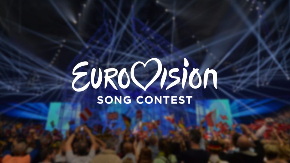
The Eurovision Song contest has launched a redrawn logo, created by Amsterdam-based consultancy Cityzen Agency.
Source: EBU
The new Eurovision Song Contest logo
The new branding is an evolution of a logo created ten years ago, and has been unveiled ahead of the competition’s 60th birthday next year. The previous design was the result of a competition launched by the European Broadcasting Union (EBU) in 2004.
Jon Ola Sand, executive supervisor of the contest on behalf of the EBU, says, ‘The logo is increasingly recognised, but that it could use a revamp after having been in use for 11 editions of the contest.’
The creation of the new design initially saw research undertaken with viewers, fans and other stakeholders to determine the ‘strengths and weaknesses’ of the former logo, says Sietse Bakker, event supervisor of the contest on behalf of the EBU.
Video:
Cleaning the details
‘It was clear to us at a very early stage that this was going to be an evolution, not a revolution, representing the evolution the contest has seen over the past decade’, says Bakker.
‘The heart, the combination between the friendly handwritten “Eurovision” word mark and a more contemporary sub-title – they had to stay. They reflect the “modern classic” the Eurovision Song Contest essentially is.’
The Cityzen Agency team was led by Cornelis Jacobs, who looked to redraw the logo into a new mark that was more defined across high-definition television and print applications.
Video:
Aligning the elements
The Gotham font is used for its ‘strong, timeless look’, says Bakker; while the new heart symbol aims to look ‘stronger’, and will now be used as a stand-alone element as well as part of the main word-mark.
Read this next

-
Post a comment


