Airbnb – the ultimate viral logo
While almost every brand wants to make content that will ‘go viral’, few seem to realise that this process will, by definition, see them abdicate control of their creation.
It takes a brave organisation to deliberately embrace this uncontrollable potential, to launch design work that they know (or hope) will generate reams of copy and comment – both positive and negative – and will spin off into meme territory.
And as if to validate is viral nature, here I am writing YET ANOTHER story about DesignStudio’s Airbnb rebrand – you can add it to the pile.
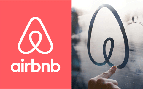
But while most commentators (with the notable exception of Brand New’s Armin Vit) have focused on the ‘controversy’ surrounding the new logo’s supposed resemblance to breasts, buttocks, a vagina or software company Automation Anywhere’s identity, few seem to have realised that this echo-chamber of hype and engagement is almost exactly what Airbnb wanted to create.
When all the dust settles, the Airbnb rebrand is likely to be seen as one of the landmark projects of 2014.
One of the reasons for this is that both client and consultancy set out to develop an identity with the very purpose of seeing it adapted, built on and bastardised by its users.
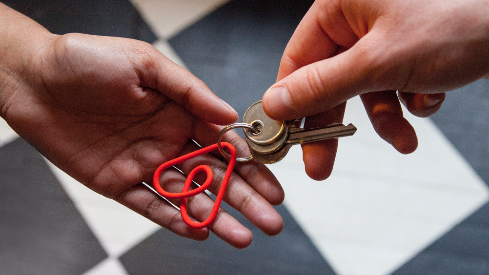
Airbnb’s constant talk of its ‘community’ might be wearisome to cynical British ears, but no-one can deny their bravery in actively handing over one of their key assets to this community, to do with what they will.
As DesignStudio executive creative director James Greenfield says, ‘We wanted to create an object that is strong enough that you can throw anything at it and it will survive.’
While discussing the identity pre-launch last week, I asked Airbnb graphic design lead Andrew Schapiro if he was nervous about what people might do with this new logo. ‘No’, he replied, ‘I’m excited’. He and Greenfield joked about how they hoped it would be adapted as an internet meme – an aspiration that has, of course, now come true.
And if Airbnb’s Twitter feed is anything to go by, the company is remarkably relaxed about the ‘social media backlash’ (as the BBC puts it) whipped up by the launch.

With the Airbnb project, DesignStudio was given an opportunity few designers ever get, to create a pictogram that might enter public discourse.
As Armin says on Brand New, the symbol could become as ubiquitous as Wi-Fi logos on cafes or TripAdvisor stickers on tourist attractions – ‘more than a corporate trademark’, as he puts it. Surely this is the aspiration of every corporation.
And if a few badly-Photoshopped pictures of boobs or dogs’ bums have to get made along the way, then I’m sure that’s a price that both DesignStudio and Airbnb are willing to pay.
Read this next


Very clever response to what is essentially someone getting caught out for copying another companies logo. So it’s ok to copy if it gets people to talk about your rebrand. Not very fair is it.
Anyone Else Had Enough / Over This Now!? 😉
Hey guys, who really cares.. really!? Apart from those too wrapped up in the world of brands.
In my humble view, but an educated one at least given that I have worked on many branding jobs myself, airbnb have made an unnecessary change to their brand.
People in the world of design and some ‘marketing’ types seems to create change for changes sake, selling it in many different packages… in this case for the ‘community’, but it gets tiresome. Some things just don’t need to be changed.
I have used their site most days to manage bookings for my holiday property and found their previous brand and website just right.