DesignStudio creates ‘symbol of belonging’ for Airbnb rebrand
DesignStudio has created a new identity for Airbnb, which centres on a new ‘symbol of belonging’.

San Francisco-based Airbnb describes itself as a ‘community marketplace’ that allows people to list and book accommodation around the world. It was set up in 2008 by designers Brian Chesky and Joe Gebbia alongside co-founder Nathan Blecharczyk.
Andrew Schapiro, graphic design lead at Airbnb, says the company was looking to rebrand as the existing identity – which had been in place since 2008 – ‘didn’t capture what Airbnb is’.


Schapiro adds, ‘We wanted to create an accurate expression of Airbnb for the long-term.’
London consultancy DesignStudio was appointed to the work following a pitch last summer.

Initially considered alongside 35 international consultancies, DesignStudio saw off nine other shortlisted groups after creating an Airbnb ‘listing’ in its office for the pitch presentation.
The consultancy then worked in close collaboration with Airbnb, setting up a design studio embedded in the client’s US headquarters. DesignStudio executive creative director James Greenfield says, ‘We had access to the whole company from the chief executive down.’
Greenfield says, ‘Airbnb centres around the idea of people belonging everywhere, so we realised we had to come up with a symbol of belonging. We also wanted to create a symbol that anyone can draw.
‘Kurt Weidemann once said that a great logo is one that you can draw in the sand with your big toe – and that’s what we set out to do.’
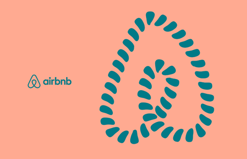
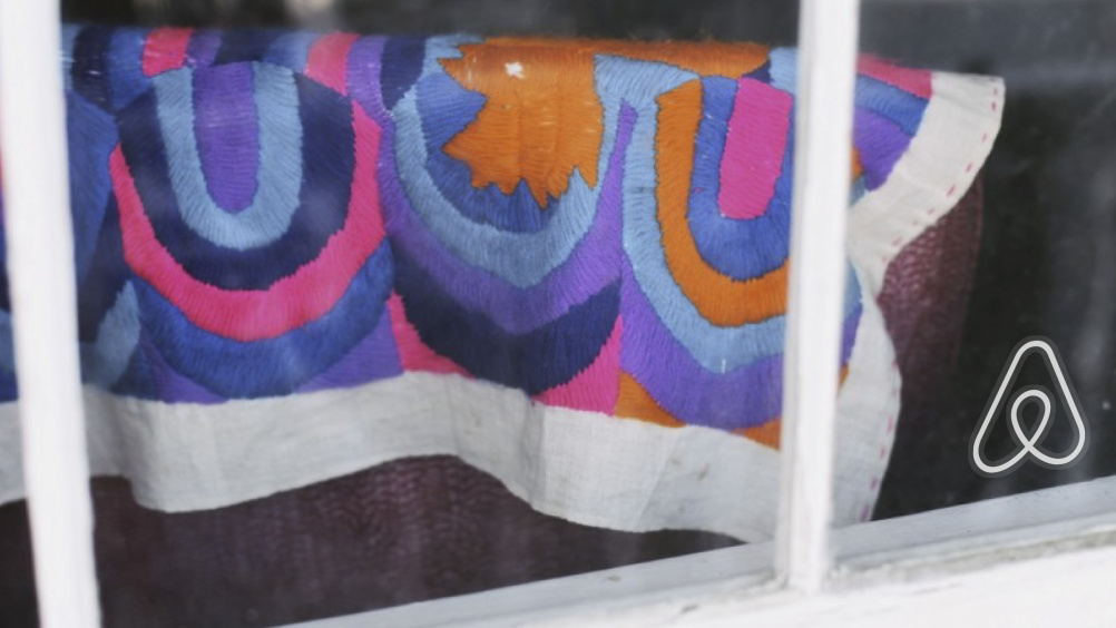
The result is an identity centred around a new pictogram. This comes in two forms. The ‘Bélo’ mark is used as the Airbnb identity, while the ‘community symbol’ can be used an adapted by Airbnb’s ‘community’ of travellers and accommodation owners. Airbnb describes Bélo as ‘an iconic mark for our windows, our doors, and our shared values. It’s a symbol that, like us, can belong wherever it happens to be’.
Greenfield says, ‘We were looking for a symbol that would draw together the four main themes of the brand [people, places, love and Airbnb]. We also wanted to create an object that is strong enough that you can throw anything at it and it will survive.’
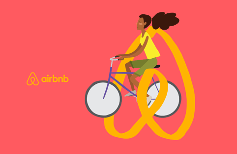
The aim is that the new mark can be adapted by Airbnb users on touchpoints such as stamps, stickers or keyrings, or through the new Create Airbnb platform. Schapiro says, ‘We needed to create something that we could put into the hands of our community.’
The previous cyan colour is dropped in favour in favour of a new red palette, while the typeface is a version of Circular, from type foundry Lineto.

DesignStudio also worked with semiotics specialist Signsalad, to examine the cultural meanings of the new pictogram, which would have to appeal to an international audience.
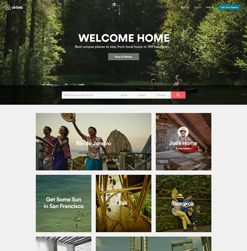
The new identity is launching alongside a new Airbnb online user experience, also created with DesignStudio.
Read this next


I have just seen an advert for iamwaters.com their logo is pretty much identical except it is upside down.
I really liked the original Airbnb logo. This thing looks like a paperclip. Also I think the whole “belonging” thing is weird. I don’t need a group – I just need a reasonable place to stay that puts money right back into the community. Also as an Airbnb host – people don’t “belong” to my home – I am just being a nice member of the community and allowing people to stay in my house and in return I get compensated.