Logo Design brands controversial phone service
Logo Design has created an identity for 118 800, a controversial directory enquiries service which will launch on 18 June.
The service, for mobile phones, has raised concerns as it pools a national database of mobile phone numbers. Individuals will be contacted through the service asking if they want to speak to the enquirer.
Appointed in March by Connectivity, the company behind the service, the consultancy was briefed to create an identity that would differentiate it from other directory enquiry services.
Jay Jones, project manager at Logo Design, says, ‘It wanted something eye-catching that would appeal to the broadest possible audience and stand out from market leaders like 118 118, which are at the top of the pile.’
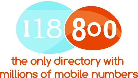
The consultancy’s work was also informed by animation from Aardman Animations for an advertising campaign that will start when the service launches.
‘Colours are drawn from its work,’ Jones says, ‘and our design is in tune with Aardman’s, but we needed to make something with a longer life that will exist after its campaign has finished.’
‘We’ve made two speech bubbles to separate the numbers and make it more memorable,’ he adds.


Horrible!
Doesn’t do anything for me, bland and boring!
Doesn’t really do anything for me, looks bland and boring!!
Doesn’t really do anything for me, looks bland and boring!!
nonsense… where are the speech blobs?
nonsense… where are the speech blobs?
……it´s certainly not the dogs “bol#cks!
Awful, bland and boring design, looks as though it was designed by a admin person, not a designer. :o{
Hmmm…. they don’t look like speech bubbles to me.
For once I’m more concerned about the service than the design. The last thing we need is people being able to get hold of mobile numbers…
That’s very poor, it looks like an early concept by an inexperienced student – in fact, it’s actually quite annoying and discordant – I’m far less likely to remember the numbers now that they have been so poorly executed.
I hope they didn’t have to pay for this…
Eye catching design… Colours work well
Dunno about you guys, but I like it ! Funky and energetic ! 🙂
Quality? where?… geezz… so much for interns…
You all seem to forget about the clients input into a design process. Everything evolves around a brief. I can see the speech bubbles and think it works.
I agree, clients can be such a negative influence when it comes to brand design. I think the design is fresh, fun and its funky styling would work well in animated commercials and bold print matter.
the colours are ok… just seems largly understated.
Haven’t you heard…. everyones a designer! For me its too plain and boring.
Looks pretty good to me. Anyone out ther who can’t see speach bubbles is lacking imagination – can’t be a designer. Colours are possibly a bit weak, but it’s going to work v. well on the move.
Oh dear, what was thinking behind this??
As a designer it’s a sad day when a lacklustre brainfart becomes mainstream, well nearly as sad as the day I saw the 2012 logo … but I digress… specsavers seems to be jumping out at me from this logo… great job… blehhh…
Hello my loved one! I want to say that this post is amazing, nice written and include almost all important info’s. I would like to peer more posts like this.