Blue Marlin repackages Purdey’s
Blue Marlin has redesigned the packaging for the Britvic-owned Purdey’s wellbeing drink.
The consultancy was appointed for the project in January 2010 following a three-way strategic pitch. Blue Marlin has worked with Britvic for more than six years on other projects including Tango and SoBe Pure Rush.
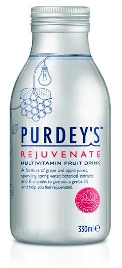
Blue Marlin was briefed to retain the original silver packaging, which preserves the botanicals and vitamins within the drink. A Blue Marlin spokeswoman describes the redesign as an ‘evolution not a revolution’, having also retained the red accented colour palette.
The bottle features new illustrative icons, such as a light bulb representing the drink’s idea-giving properties, and scissors to represent its ability to sharpen the mind.
Information on the back of the packaging, with copy also by Blue Marlin, explains the properties of the drink.
Blue Marlin London creative director Simon Pendry says, ‘The new design tells the brand story and explains its ethos through both illustration and back and front-of-pack copy. It is sophisticated and engaging and a little intriguing.
‘For instance, some of the drawings are numbered with a key on the back explaining that it contains vitamin C and counts as one of your five a day.’
The new packaging will begin to roll out next week.
-
Post a comment


