Samsung runs with Kate Moross-designed Olympic logo
Illustrator Kate Moross has designed Samsung’s new Olympic logo, which will go into use for the London 2012 Games next year.
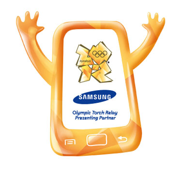
Moross says she was approached by Olympics sponsor Samsung in November 2010 and tasked with creating a logo that would be inclusive and would empower young people to get involved and create a festival atmosphere.
Moross says, ‘I tried not to think too much about hitting the goals and bullet points that they asked for.’ She adds, ‘I wanted to make something fun and brightly coloured.’
The final logo was chosen out of around 50 variations, and is a hybrid design of a number of these.
The logo is a key part of Samsung’s Olympic project named the SOVIS – Samsung Olympic Visual Identity System.
Comments


Awful!
She should stick to putting triangles on things.
Looks like the Korean reincarnation of the Cingular Wireless logo.
Catastrophic fail. I always tought who are this people who produce this type of visual carbage. This is just offencive towards millions of people. Please stop this stuff. This is not a joke any more!
“The final logo was chosen out of around 50 variations, and is a hybrid design of a number of these.”
Says it all really…