B&B Studio creates Bear Alphabites look
Fruit snacking brand Bear has moved into the cereal market with a packaging design by B&B Studio.

The new Bear Alphabites are ‘a tasty affordable solution to a healthy breakfast for children with absolutely no added nonsense,’ according to Bear, which has developed a cereal containing coconut nectar, harvested from the flowers of coconut trees.
B&B named Bear, designing its look, identity and packaging when it rebranded from Urban Fresh Fruit in 2009.
Bear marketing manager Emma Hines says, ‘We needed to create a natural, bold and simple box that was totally true to our brand and communicated clearly what our product was while ensuring that it stood out proudly in a category renowned for being bright, bold, and full of big characters.
B&B’s handcrafted 3D collage scene immediately felt true to our style and a natural step forward for the brand.
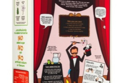
The front of the box spells out a theme in the bowl graphic, and includes the likes of ‘Bears’ ‘Pirates’ and ‘Magic’. These are picked up with an illustration toward the top right, which references the theme.
The top of the packs carry full-length illustrations, such as one of a padlocked treasure chest on the pirate-themed pack.

Underneath the pack ‘curious little cubs’ can find a note in keeping with the theme according to Bear. The Space-themed box for example reveals, ‘We have lift off.’
Information on nutrition value and product USPs has been illustrated in keeping with the rest of the pack design.
Back-of-pack designs have been created by Bear’s in-house head of creative Victoria Hemphill.
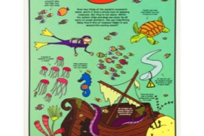
Each back-of-pack relates to a particular letter – P is for Pirates, E is for Egypt, and B is for Bears for example. Eight designs have been developed and tie in with the themed pack designs by B&B. The remaining 18 letters will roll out over the next year.
Read this next

-
Post a comment


