Heineken launches new can design
Heineken is introducing a fresh redesign to its beer cans that dials down the brand’s trademark green to emphasise the aluminium in the hope of appealing to contemporary men.
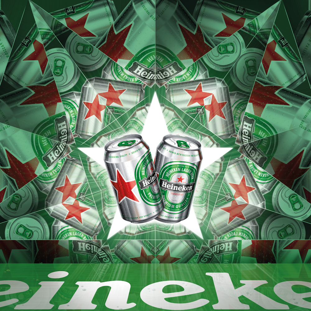
Heineken has redesigned its cans to appeal to contemporary, city-dwelling men.
The new ‘Star Can’ is rolling out to the 170 countries where the beer is sold, with some markets to start selling ahead of the crucial summer sales season.
It follows the redesign of Heineken bottles, which launched last year.
The new can design appears on all sizes and is already available in travel retail outlets across Western Europe.
The update, created by Dutch consultancy DBOD, is the first in five years and plays up the can’s aluminum elements to create a more ‘masculine’, ‘thirst-quenching’ look.

Mark van Iterson, Heineken’s manager of global design and concept, says, ‘Bare aluminium looks fresh and thirst-quenching when you take the can out of the fridge.
‘The red star is one of Heineken’s most important visual symbols and has always been part of the brand identity. We’ve made it larger and more visible so it really stands out to consumers.’
Heineken has also replaced the white centre of the green logo so that it is more in-synch with the rest of the can.
The designs of cans is said to be of growing importance by alcohol experts, who cite manufacturing advancements for stopping the beer in the cans tasting like metal.

The trend has been especially prevalent in the US where big and small brewers alike have revamped the designs to enhance the taste and appeal to more discerning drinkers.
Heineken hopes its own effort will set it apart on store shelves worldwide as it ramps up efforts to target men living in cities.
Van Iterson says, ‘Design generally is crucial for most products as it creates appeal for consumers. I believe that design is the premium-ness of this era.
‘When it comes to packaging, the design is also the most tangible point of contact between a brand and consumers – they can literally feel it.’
–––––––––––––––
This story first appeared on Marketing Week.


Not sure how the design works on the back being connected on one side. I imagine it looks clumsy. Brave effort. Has no chance entering any Eastern European markets with communist connections/histories. Speaking as a pessimist.