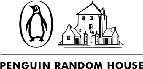
Penguin Random House launches new identity
Penguin Random House has launched a new identity, following the merger between the two publishing giants last year.
The wordmark has been developed by Pentagram partner Michael Bierut, and replaces an interim identity that has been in use for around 12 months.
The identity will be most often used in conjunction with one of the company’s publishing divisions, imprints and brands. PRH operates 250 brands, including DK and Crown.

PRH says, ‘The brand system, as this pairing design framework is called, is flexible and can be employed not just at the publishing level, but also territorially. The imprints and brand symbols also can continue to stand alone without the brand-system pairing – for example, on the spines of books.’
Bierut says, ‘Like everyone else we tried every zany combination of penguins and houses, and many abstract symbols that had nothing to do with either.
‘The issue turned out to be that it just didn’t make sense to create a new symbol for a company that already has 250 symbols, none of which are going away, and each of which has heritage and value on some level. So the trick was to come up with a wordmark that could at once provide a strong endorsement for each of the imprint symbols, and that could in turn gain itself in meaning through association with them.’

He adds, ‘Penguin and Random House both have amazing design legacies: the original Random House logo was drawn by Rockwell Kent, and the classic Penguin cover format was formalised by Jan Tschichold, and on and on. Yet the two companies have had quite different branding strategies, the Penguin being a “branded house” and Random House as a “house of brands.”’
‘The new system very deliberately balances both strategies.’

The new identity uses the Shift typeface developed by Jeremy Mickel. According to Bierut, Mickel also adjusted the lettering in the wordmark ‘to make them really sing’.
Bierut says, ‘We needed a typeface that was neutral enough to work with all of the very different imprint symbols. Yet we didn’t want a cold sans serif, but rather something that had a bit of literary quality.
‘Shift combined those two things, along with good legibility at small sizes. And the fact that Jeremy Mickel based Shift on typewriter fonts provided another connection to the traditional world of writers and writing.’

PRH chief executive Markus Dohlesays, ‘Presenting our new Penguin Random House wordmark side-by-side with each of our publishing imprint and brand symbols powerfully communicates what makes our company so special: our collective expertise and global scale coupled with our local publishing teams giving diverse and important voices a platform and audience.
‘This fundamental understanding of our heritage and of the company we are building together for the future informs the design of the brand identity, and how we will visually represent who we are.’


How incredibly underwhelming
That’s a lot of words & visuals mixed in with a jumbled animation to try and justify a sub-par logo which is already flawed in the visuals shown in the article.
‘Like everyone else we tried every zany combination of penguins and houses, and many abstract symbols that had nothing to do with either.’
– Is that how Brand Experts work these days…. what a let-down.
They talk about the “amazing design legacies” of both brands and decide to pay homage to this fact by creating something so ‘throw away’.
I would agree that the font does have “a bit of literary quality”… a bit… maybe next time aim for a lot?
A sad day for both of these iconic brands.
Big disappointment!
….brilliantly well done to the writer who ‘constructed’ the creative rationale…
Fantastic ‘sell’ of an awful logo.
I would love to know the budget this was given!
Not sure if any of the above comments read the article or understand the purpose of this identity, but I think it works wonderfully. A subtle word mark, with a bookish twist that still lets the multiple brands it represents and partners stand out.
Great use of the Shift typeface too.
Given all (bar you Tom) think the same (who I believe can all read Tom!!?!) I would say the same with your comments Tom!
Matt & Laura’s comments are especially spot on!
You are right though Tom, it is a Great Use of a Shit typeface!
Tom:
Just so you know I’ve had a Grown-Up read the article out to me and now I understand its purpose.
It still doesn’t work!