Road signage-inspired new identity for Westmorland service stations brand
Manchester-based consultancy Squad has designed new branding for Tebay and Gloucester Service stations, creating an identity informed by road signage typography and imagery.
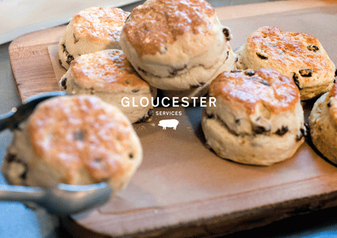
The work creates an umbrella identity for Tebay Services and its associated business, and its new sister operation Gloucester Services, which are operated by family company Westmorland.
Westmorland was founded in 1972 by John and Barbara Dunning of Tebay, Cumbria, who opened the Tebay Services partnership with local bakers when the M6 cut through the Lune Gorge.
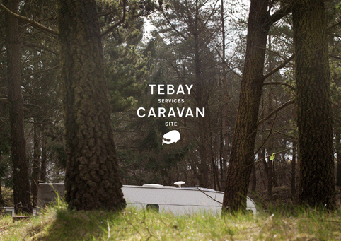
The company continues to be family run, and now encompasses the Tebay Services Hotel and caravan site; a Truckstop at nearby Junction 23; the new Gloucester site and the Rheged visitor centre in Penrith with a gallery, shops, cafes and cinema.
Squad says, ‘The challenge faced by the Squad team was taking a brand so intrinsically linked with its Cumbrian hometown of Tebay, and making its story relevant in Gloucester and beyond.’
It adds, ‘They needed some help defining their purpose and beliefs’.
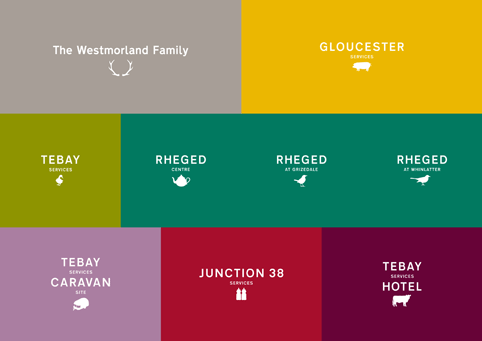
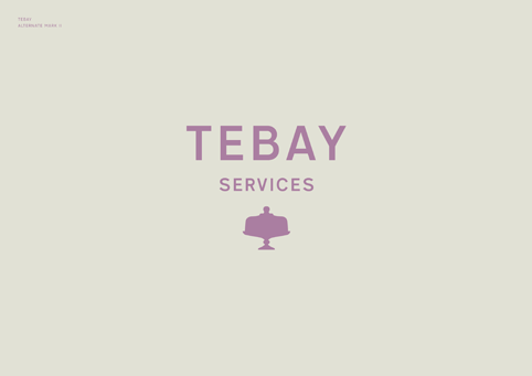
The consultancy created an identity using the Transport New font, with a colour palette Squad describes as ‘more sophisticated…not normally associated with motorway services’.
A number of road signage-inspired pictograms are used across the branding.
David Barraclough, Squad founder and creative director, says, ‘Road signs express a place, and though they seem fairly perfunctory there’s beauty and craft in those signs is you look back to Calvert and Kinnnear, just as Tebay’s a little gem.
‘The pictograms add an element of craft. We drew them in a bit more of a delicate fashion than on road signs’.
A duck, drawn from a photograph of a duck at the Tebay site, forms the ‘hero icon’, says Barraclough. Other images include a tractor, a teapot and a cow; with each set of icons tailored to the place to which the branding is applied.
Squad created a brand film voiced by John Dunning. The film and brand photography is by Percy Dean.
Barraclough says, ‘Having identified the brand’s core story it was important to us all that the creative expression has the same level of depth.
‘We created a strong and adaptable identity for the group that will translate well into their different sites, allowing each place to celebrate what¹s special about that place.’
Read this next


Lovely Stuff!!!