A folded laundry identity for White Knight laundry services
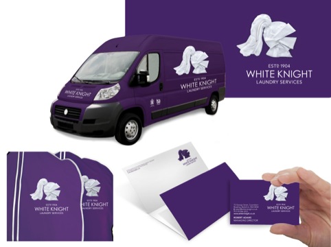
Coley Porter Bell and consultancy Frasers have created a new identity for White Knight laundry services, creating a logo and other graphic devices from folded laundry.

Coley Porter Bell creative director Stephen Bell says, ‘They had noticed the market was getting more and more competitive but the identities were all much of a muchness, so it was time to move forward.
‘They wanted to keep the name but to feel quite different – it’s an evolution, but a really bold one.’

He adds, ‘The identity expresses the strategic thought “Laundry your way”.’
The brand’s Royal Warrant status informed Coley Porter Bell’s designs, which use a white knight’s helmet logo formed from white origami-style folded cloths. A purple background is used throughout to reference the ‘regal’ heritage, and new Century Gothic typeface has been introduced.

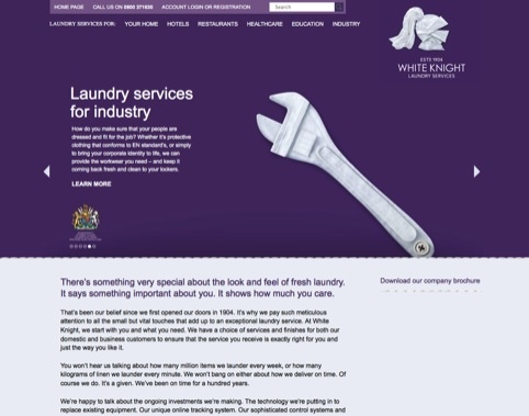
Frasers adapted the logo and also worked to apply the identity to touch points including the vehicle livery, brochures, exhibition stands and stationery items. Frasers also designed the website and are currently completing the brand guidelines for the identity’s future applications.

Other sector images such as spanners, suitcases and flowers were also designed by Frasers and have been formed from folded linen by a seamstress and photographed in their studio.
Bell says, ‘We thought the fabric was a really nice twist. It’s a bit witty and also speaks of what they deliver – beautiful crisp linen. It’s modern and dynamic, but the heritage is still there.’


This identity make me a lot thinking about the EagleClean identity designed by The Partners:
http://www.the-partners.com/project/eagleclean/brand-identity