Alpha Males – Man Book
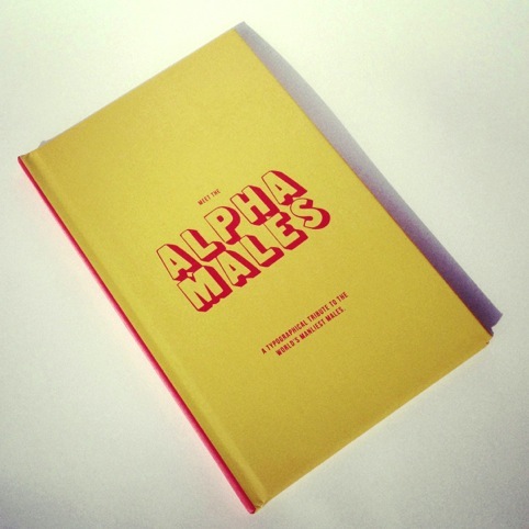
Following the success of the Alpha Males typography series, a book of the same name has been published, celebrating ‘the world’s manliest males in typography.’
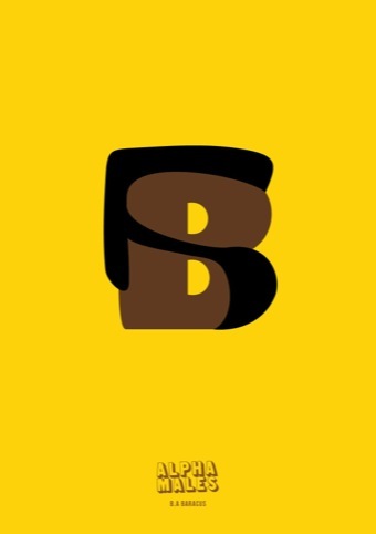
The Alpha Males typography series designed by ad creatives Stuart Jackson and Gareth Hopkins caused quite a stir earlier this year with its tongue-in-cheek take on manliness.
A new letter was released everyday on the Alpha Males blog. Now the 26 manly suppositions have been muscled into this book.
‘We’re both really into strong typography, and started looking at creating something bright, engaging and simple, playing off the term alpha.’
There’s more to come from brand Alpha with a children’s alphabet in the offing. Alphamore will be a learning assisted typographic set of creatures aimed at 3-4 year olds, which Jackson hopes to release as an iPad app.
Hopkins is senior copywriter at We Are Big, and has already written several children’s books, while Jackson, who has designed the graphics is creative director at consultancy RBH and a founding member of Young British designers.
For a copy of the book and more information on The Alphas, head to thealphas.co.uk
Read this next

-
Post a comment


