The Changing Faces of Bowie
Today sees the release of David Bowie’s first album in more than a decade, and to celebrate, we’re bringing you a marriage of two of our favourite things: Bowie and typography.
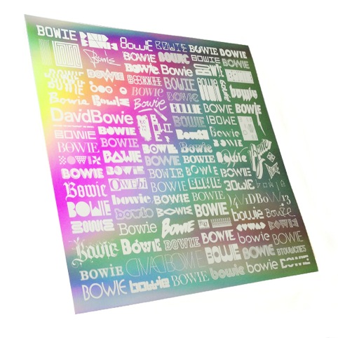
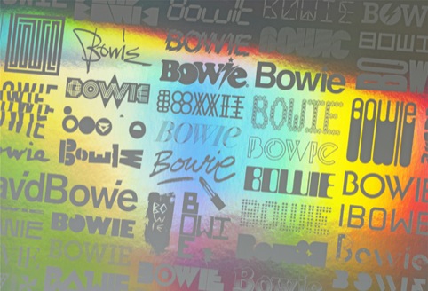
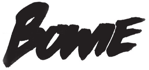
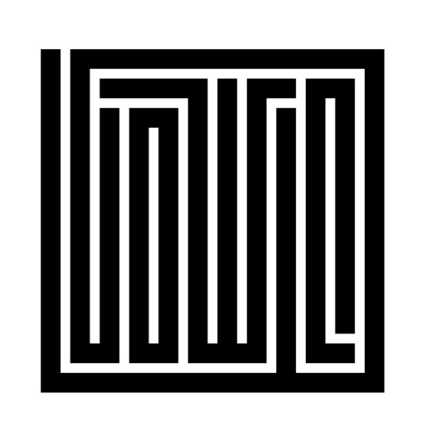
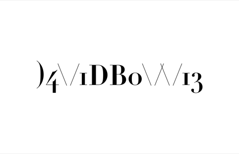
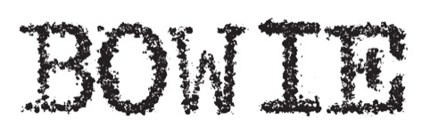
The Changing Faces of Bowie project saw 100 designers and artists invited to create a logo, forming the word ‘Bowie’ from a custom typeface.
Contributors include Jonathan Barnbrook, Anthony Burrill, Angus Hyland, Trevor Jackson, Emmi Salonen, Claudia Klat and Tony Brook from Spin and Brett Wickens, partner of design constultancy Ammunition.
The project was commissioned by designer Mark ‘Blam’ Blamire, who has collated the 101 contributions to form a rainbow holographic print, sold exclusively by the V&A for the duration of its forthcoming David Bowie Is exhibition.
The brief for the designers was two-fold: they had to create a typographic work that not only acknowledged Bowie’s widespread adoration by a hugely varied audience; but also represent his ever-changing chameleon-like image.
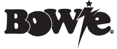
And, like the Thin White Duke himself, the typographic Bowie guises are hugely varied –some accessible, some difficult, and some out-and-out glam, like David Jones’ submission. He explains that the work is ‘a modern interpretation of a graphic I painted on my school satchel in ‘73. I did it with silver Airfix paint and it sat very well next to my MUFC Rule OK (in red, black and white) design.’
A more oblique approach was taken by Harry Heptonstall, who looked to Bowie’s 1986 film Labyrinth for inspiration.
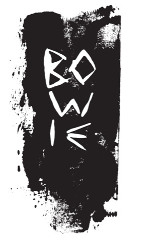
James Nelson’s inspiration – while not from Mars – was drawn from the rather Bowie-esque source of ‘another planet.’
‘I had a waking dream of a David Bowie totem’, says Nelson. ‘A mysterious ancient thing that arrived from another planet.
‘The totem represented a timeless reminder of Bowie’s legend. The carving is how I imagined Bowie’s name would appear on the totem; the dark surrounding print is suggestive of the totem’s shape.’
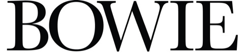
Creative Review’s Gavin Lucas was also among the project’s participants, creating this type treatment inspired by his favourite Bowie cover, Aladdin Sane.
For Wickens’ piece, the designer looked to design a logotype that was itself ‘a metaphor for Bowie’s surprising changes of style and evolution’, says Ammunition. As such, he chose to use a Didot typeface and ‘LEET-speak’ – the language used by computer hackers that sees certain letters replaced by other characters.
You can buy the 50x50cm print for £45 from the V&A shop here
Read this next

-
Post a comment


